


By Karen Yu ’16 This year, Story Maps have been an increasingly important part of what we do in the SAL – see our recent post Story Maps in the Classroom for an overview of the different ways we’ve been using them. A quick recap for those that don’t know: Story Maps are a user-friendly way to look […]
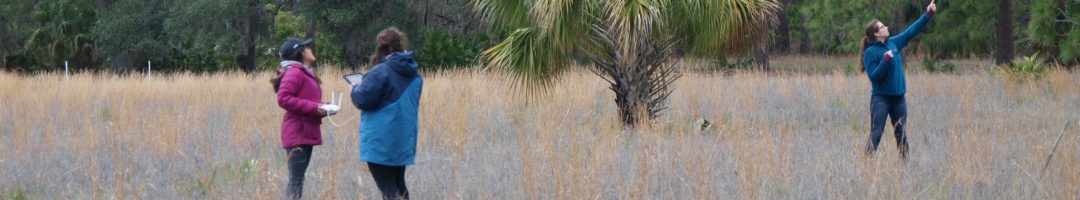
A Low Altitude Aerial Perspective of San Salvador, The Bahamas
What do the Bahamas make you think of? Maybe beautiful beaches, nice resorts, and possibly coral reefs? I know that my first associations with the Bahamas were definitely not drones and hurricanes, but this January I got to see how these things all fit together. I had the privilege of joining a crew from the […]
Story Maps in the Classroom
Maps are increasingly popular as storytelling tools in the world of digital media – just a glance at the homepages of the New York Times, The Atlantic, or the Huffington Post confirms that. We’ve experienced this wave of mapping enthusiasm in the SAL, and it’s already started changing how we teach GIS. Moreso than conventional GIS maps, Story […]
Interterm GIS Course
Like most years, the SAL team taught a week-long GIS course during interterm to give a GIS jumpstart to students who want to learn what GIS is all about but can’t take (or haven’t yet taken) the semester-long GIS course. This year, however, we made some big changes to our curriculum that we’re pretty excited […]
SAL website feedback
Whether you’re a regular, occasional, or potential user of our website, please help us to better serve you by filling out the following short survey. [123-contact-form i1701302]
December Mystery Map winners
Out of the 70 people who viewed our Musical Mystery Map in December, eight sent in answers, and nearly all of them got at least a part of the question right. So, in order of submission, here’s who correctly guessed that the size of the bubbles represented number of bells: Leslie Vicente Soto Anonymous (we […]
Snowflake Map
Following the popularity of our Thanksgiving break Tofurky Map, the SAL team has put together a Snowflake Map to see where the Smith community will be spending the holiday break. Scroll down to put your own snowman on the map and to see where your classmates are travelling! Loading… Refresh page to see your submission.
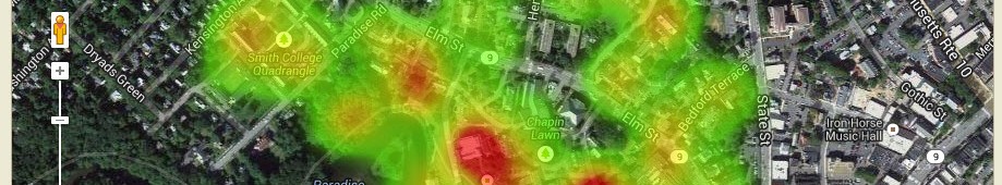
December Mystery Map Unveiled!
Step aside Facebook, Instagram, and Buzzfeed: procrastinate productively and challenge your spatial reasoning skills with the SAL’s latest Mystery Map Competition! This Mystery Map is an interactive, multimedia map developed using CartoDB. We recommend taking some time to explore the map to see if that helps you answer the following questions: 1. What can you find […]
November Mystery Map Wrap-Up
Our November Mystery Map has been live for three weeks, and since most Smithies are now concentrating more on procrastinating finals than on last month’s election, we’ve decided it’s time to wrap up the competition. As a reminder, here’s what the Mystery Map looked like: As another reminder, we issued a hint ten days ago that […]
Tofurky Animation
We’re thrilled by how many responses we got to our 2nd annual Tofurky Map. Almost 200 people posted to the map, and over 1,250 people viewed it! We created an animated map showing submissions over the week of Thanksgiving. We used a very cool tool called Torque from CartoDB, […]