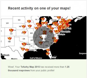
 We’re thrilled by how many responses we got to our 2nd annual Tofurky Map. Almost 200 people posted to the map, and over 1,250 people viewed it!
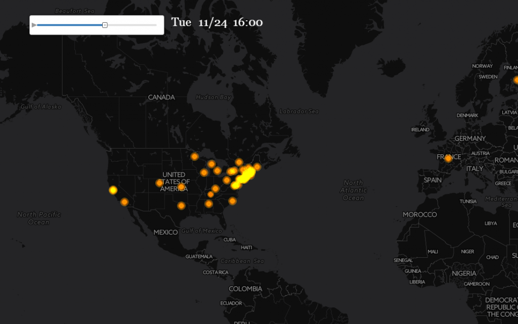
We created an animated map showing submissions over the week of Thanksgiving. We used a very cool tool called Torque from CartoDB, which is specifically designed for animating data over time. Click on the image below to see Smithies post their destination on the map as news of the map spread! Direct link to full map animation