Our November Mystery Map has been live for three weeks, and since most Smithies are now concentrating more on procrastinating finals than on last month’s election, we’ve decided it’s time to wrap up the competition.
As a reminder, here’s what the Mystery Map looked like:
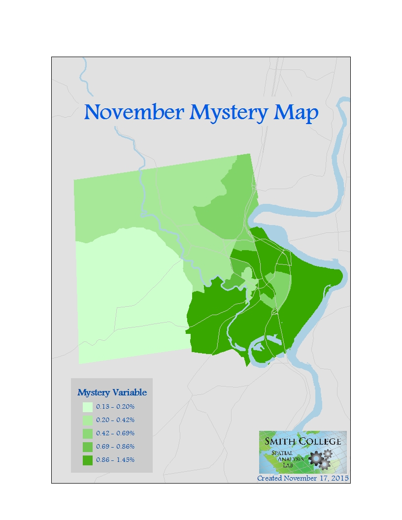
As another reminder, we issued a hint ten days ago that this map shows some kind of electoral data. So what exactly does the green shading on this map show?
Drum roll please…..
The percent of registered voters who are enrolled in the Green-Rainbow Party, the Massachusetts affiliate of the Green Party USA!
Guesses ranged from almost correct to downright strange. Our most interesting guess was this: “we dont caree about elections!! we want water”. I know everyone’s super busy with finals right now, but please remember to hydrate!
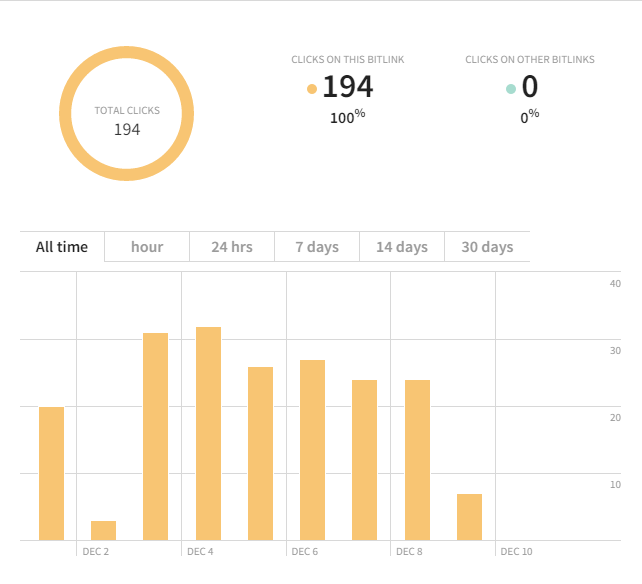
With 200 views and only 10 guesses, this Mystery Map may have been more difficult than intended…
We had one anonymous guesser get it right, but sadly we can’t name someone a winner without… well, a name! Among non-anonymous guesses, Robin Austin came closest. She guessed that this shows the percentage of votes cast for Green Party candidates in the most recent election. Congrats for catching on to our color scheme and guessing this had to do with the Green Party!
At first there might not seem like too big of a difference between the number of votes for a party and the number of registered voters in that party. For those charged with polling, advising candidates, or predicting election results, however, the difference is important, since in many elections (especially at the local level) many or most registered voters don’t actually cast a vote. Among those who do, many don’t vote for the party they’re enrolled in.
This mystery map is a great lesson in the need for interpreting a map. Think of a map as a text, like a newspaper article. When reading a newspaper article, you probably don’t just take what the article has to say at face value. You think cues besides the text – in other words, the subtext – that gives added meaning to the article: who wrote this? for what publication? what sources are they using? what’s the tone of their writing, and how does that affect the information they’re presenting?
Maps have subtexts, to, such as the color scheme used. Think about it: color is packed with cultural associations! In the realm of politics, if you saw a map of the US divided into red states and blue states, you could infer without a legend that it has to do with the split between Democrats and Republicans. Similarly, though we don’t often seen maps of the Green party, it’s usually represented with green. So I was hoping that the green shading would add a little more meaning to the numbers that the map expressed. Shoutout to those of you who guessed things like walkability or bikeability rating based on green’s association with environmentalism! If I had chosen to use an orange or a white-black color scheme instead, that would send a different message along with the raw data.
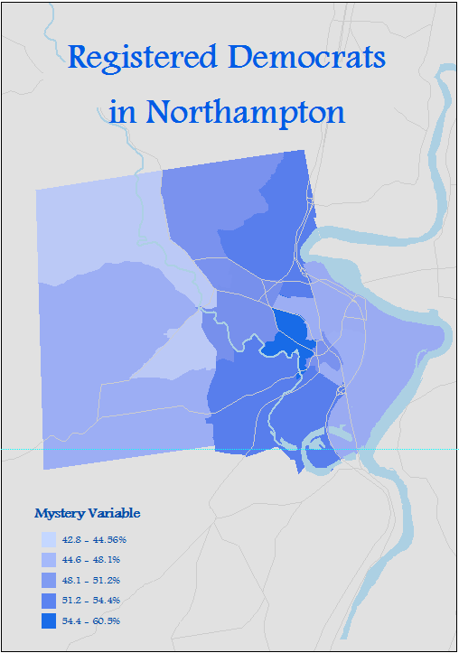
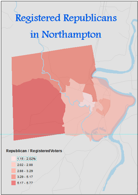
The map also shows the east-west divide in Northampton that we’ve seen in other political maps produced by the SAL. The entire city is very liberal compared with surrounding towns and the country at large. Interestingly, the two largest groups of registered voters are Democrats (9,709 voters) and those not enrolled in a party (8,792). With only 734 voters, the Republican party essentially serves as a third party in the city, closer in number to the 128-person Green-Rainbow party than to the Democrats or independents.
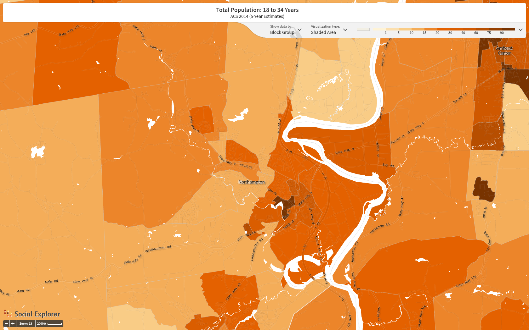
It seems that the eastern part of the city – the downtown area and the neighborhoods around Smith – is more liberal than the more moderate/independent western part, which includes the smaller hamlets of Florence and Leeds, as well as large rural areas. The eastern part also tends to be younger, which I’m guessing is not a coincidence. (By the way, the map below of 18-34 year olds in Northampton is from Social Explorer, an amazingly easy tool for exploring demographic data that Smith students, faculty, and staff get free access too!)
18-24 year olds as % of popoulation by census block group in Northampton, MA