By Karen Yu ’16
This year, Story Maps have been an increasingly important part of what we do in the SAL – see our recent post Story Maps in the Classroom for an overview of the different ways we’ve been using them. A quick recap for those that don’t know: Story Maps are a user-friendly way to look at online, interactive maps that tell narratives. They offer a dynamic way to present information and are a versatile medium for any topic of study.
Last semester, I used Story Maps as one way to showcase my ENV 312 capstone project. Together with my teammates, Siiri Bigalke ‘16J and Maria Cristina Del Valle ‘16, I worked on a project exploring climate change vulnerability specific to Smith College campus. To put it simply, we were looking at the ways in which Smith as an institution may be negatively impacted by current and future forms of climate change. At the end of the semester, we created a Story Map to present the results of our inquiry and the suggestions that we had for the school.
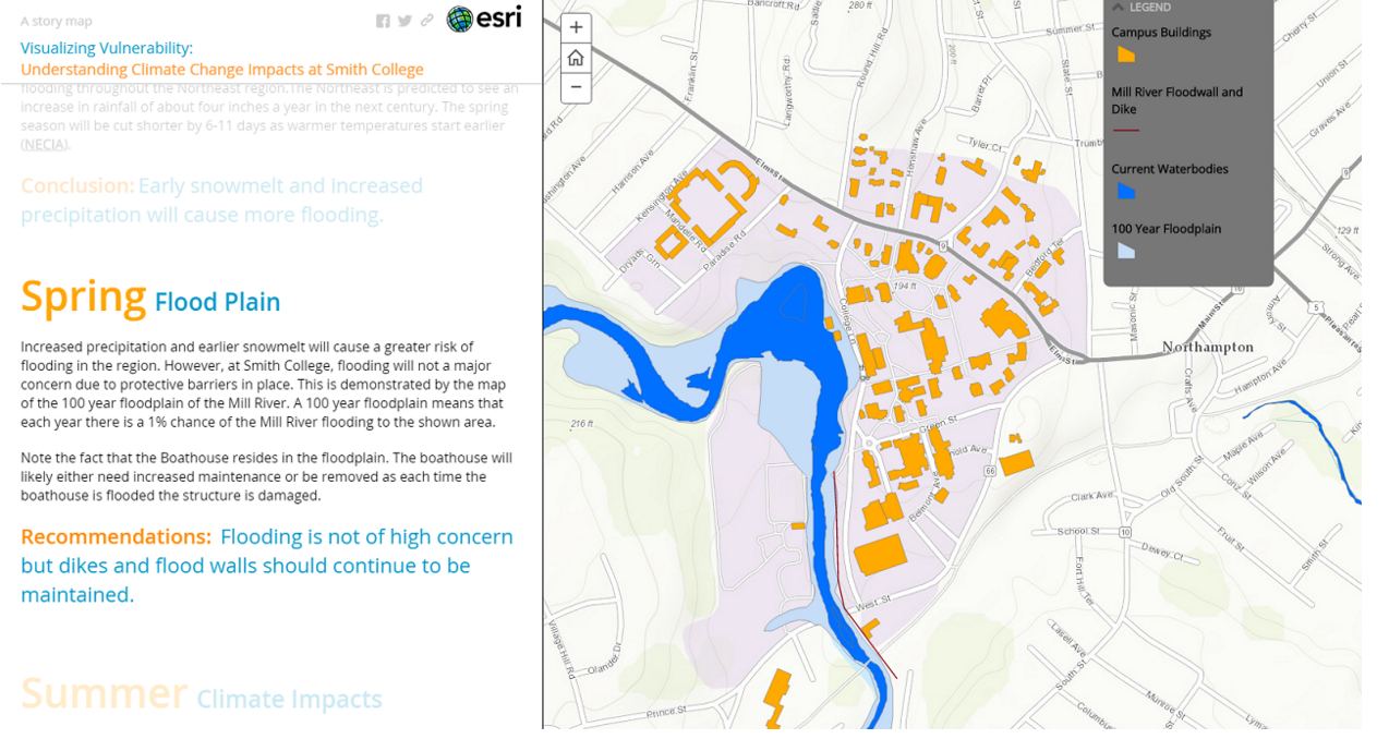
A preview of what our Story Map looks like. Included is a map of floodplains around campus.
Throughout the process, we used ArcGIS Desktop to create our maps with many forms of preexisting data. At the same time, we also incorporated interviews and local knowledge into our project. Story Maps provided the ideal medium for us to blend the two forms of information; you can showcase such a range of information on the Story Maps from audio interviews, to high res images, to our maps of campus.
The process of using Story Maps is a little different than just using the traditional ArcGIS software. Instead of being limited to using a computer in the SAL, we could access our files online at anytime of day and from any computer. We could upload shapefiles from one computer and have them viewable to the public. Storymaps allowed us to share even more information than a traditional map; for example, there are interactive features that allow the Story Map designer to configure pop-ups that display important data about each feature on the map.
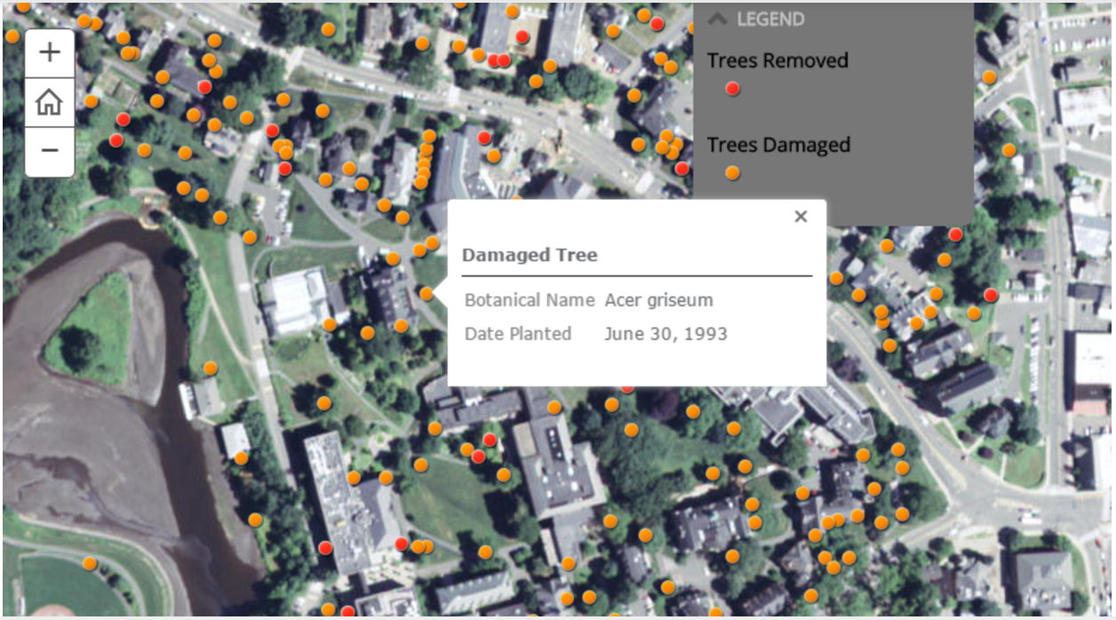
One of the maps in our Story Map shows damaged trees on campus after “Snowtober” 2011. The map is interactive in that users can click on each dot, representing a damaged tree, to see more detailed information on the tree.
For me, Storymaps really represent a new way that we as people in the digital age can process and visualize the plethora of data around us.They’re (relatively) easy to make, fun to view, and adaptable to any class or project. Stop by the SAL soon and come learn how to make one yourself!
Karen is a senior Environmental Science and Policy major, SAL assistant, and GIS whiz.