Be sure to look for our next Mystery Map or Mystery Map Game coming in October.
September 2012
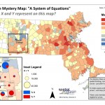
A System of Equations
2012 Series, Vol. 2
Another Mystery Map / Game for the Smith College Community.
The answer is:

Making of the Mystery Map
There were two steps in making the mystery map: finding and formatting the data, and choosing colors and symbols to represent that data.

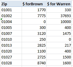
The Federal Election Commission publishes data on campaign contributions and spending for all candidates for national office (presidential races, U.S. House races, and U.S. Senate races). The records are almost scarily detailed. We went to the Massachusetts page and downloaded all contributions for both Brown and Warren. We then summarized the contributions by zip code using the pivot table function in Microsoft Excel, so that we had the total $$ donated to Brown and the total $$ donated to Warren for each zip code.
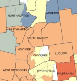
Since a zip code is a geographic unit that can be mapped, we could match these contribution sums up with a pre-existing map of zip codes in Massachusetts from the U.S. Census Bureau using a procedure in ArcGIS called joining. This let us combine the campaign finance data (from a spreadsheet) with the map of the zip codes in order to display a map of campaign finance data. We also took this one step further for the Pioneer Valley– we re-summarized the zip code $$ sums to show the amount contributed at the town level, using a tool in ArcGIS called (you guessed it!) summarize.

Once all the heavy lifting was done, we just had to choose the bestcolors. As the hint — “The colors are significant” — suggested, red and blue have taken on widely recognizable political implications in America, with blue referring to the Democratic Party and/or liberal political views, and red being associated with the Republican Party and/or conservative political views. We stuck with these cultural associations to give you, our guessing audience, a hint as to the nature of the map. Another fun fact about the colors: In the main map, zip codes are shaded yellow where the contributions to the two candidates are equal, but zip codes are left blank (white) where there were not any contributions to either candidate!
Special Thanks to Cory Keeler, the Spatial Analysis Lab Post-Bac Fellow for doing the heavy lifting to create this fine map.