With almost 600 views, our most recent Mystery Map proved to be one of our most popular. And perhaps one of our easiest as well – of the 14 submissions received, all correctly identified the theme of the map as the spread of the zika virus.
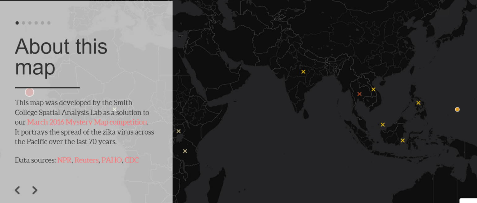
Click on the image to launch a story map showing the spread of zika since 1947
Here’s our official winner list, in order of submission:
- Sam Masinter
- Tracy Whelen
- Alex Barron
- Diana Barnett
- Meg Thacher
- Alyssa Blue
- Martin Green
- Jenna Lanterman
- Angela Acosta
- Julia Portocarrero
- Yasmin Eisenhauer
- Carolyn Brown
- Olivia Mallari
- Emily Grote
We decided that the most creative title award goes to Meg Thacher, who titled the map “Round the World in 64 Years.” Here’s her explanation:
The virus started in Africa and progressed to Asia, Micronesia, South America, Central America, and the Caribbean, and seems to be wrapping back around to Africa, with an outbreak in Cape Verde.
One of our winners, Alyssa Blue, thought she may have found the answer the wrong way. Here’s what she wrote us:
I couldn’t decide if I was allowed to do additional research, from the layout of the map I was able to tell it was about the spread of something probably a disease with the population dots and from there I researched until I decided on the most likely candidate.
Worry not, Alyssa! We try to make every mystery map a learning moment, and we’re thrilled when the spatial patterns that our readers find inspire them to do some further research and learn about a new topic.
The making of this map proved to be an interesting and challenging process. Here’s a glimpse into the process:
Challenge 1: finding data
There’s no shortage of news articles about zika online. Since it kind of came out of nowhere, though, there is a relative lack of hard data. So to make this map, I turned several news articles and web pages – from NPR, Reuters, the New York Times, the CDC, the Pan America Health Organization – into a CartoDB table containing information on where and when outbreaks occurred, and how many people were likely affected.
Challenge 2: calculating centroids by year
My goal for this map was to do all of the necessary spatial analysis without the use of desktop GIS programs such as ArcGIS and QGIS. To accomplish this, I tried to do all spatial analysis using a tool called PostGIS (just that name throws me into an existential crisis!!). My first task: find the centroid of each outbreak. More specifically, find the weighted centroid – so that the centroid would be proportionally closer to countries with 10,000 cases than to countries with less than 10 cases. These were the little triangles in the map with outbreak years above them. As it turns out, this is not as easy to do in PostGIS as in a desktop GIS, since PostGIS has no weighted centroid tool. However, it’s still possible by manually weighting and averaging the x and y coordinates for each outbreak location. Here’s the code that I used:
SELECT
cartodb_id,
year,
cases,
ST_Point( SUM(ST_X(the_geom_webmercator) * cases) / SUM(cases), SUM(ST_Y(the_geom_webmercator) * cases) / SUM(cases)) AS the_geom_webmercator
FROM zika_outbreaks
GROUP BY year
Challenge 3: draw the path of zika
Things got a little trickier when I tried to make a line connecting the centroids to show the path of zika since 1954. In theory, it should be possible with this code:
SELECT
MIN(cartodb_id) as cartodb_id,
MIN(year) as year,
ST_MakeLine(the_geom ORDER BY year) as the_geom_webmercator
FROM
zika_centroids
This code orders all of the centroids by year, and then makes them into the vertices of a single line. You’d expect this to generate a line across the Pacific ocean. Here’s what I got instead:
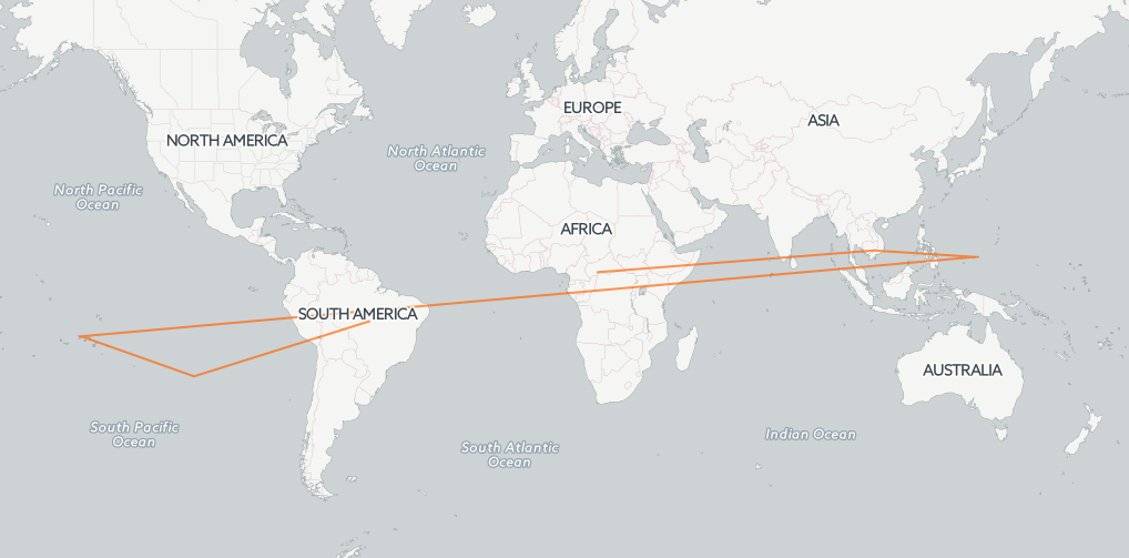
Attempting to draw the path of zika in a Web Mercator projection
So what gives exactly? As it turns out, in Web Mercator, the map projection used by nearly every web map, the left/west side of the map starts at zero and increases as you go right/east. This means that at around the international date line, there’s a sudden break – the x-coordinate goes from extremely high to 0. So, two adjacent points in the Pacific separated by the international date line are interpreted as being on opposite sides of the map.
In order to correctly draw this line, you would need a map projection centered on the Pacific. This is not an easy task when working with web maps – no matter how you store data, in the end it’s always transformed back to Web Mercator for display. To get around this, I did some good old-fashioned digitizing (making a new line on either side of the international date line).
The projection issue is a pretty fundamental one, especially when working with global data. So, are we living in a post-GIS world? Not yet. So, worry not! For the time being, you’ll still have to rely on me and Jon guiding you through the “elegant” world of desktop GIS programs.