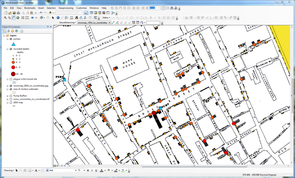
This semester has flown by– it’s hard to believe that Spring Break has already come and gone. Though much of what we do in the SAL is support classses on an ongoing basis throughout the semester (like ENV 201/202 and ARH 150), it is always fun to have the chance to work with classes for a short time and see how GIS beginners can use maps to broaden their perspective on, and understanding of, subjects they’ve studied in-depth. We had that opportunity last week when the SOC 232: World Populations class spent a day exploring GIS as part of their unit on John Snow’s famous map of the 1854 London Cholera epidemic.
John Snow’s map was a groundbreaking application of cartography to understanding the spread of disease. He did with pen and paper what modern GIS software allows us to do on the screen: by mapping the number of deaths at each address, and the location of water pumps, Snow was able to visualize the spatial correlation between cholera mortality and water source, and developed a hypothesis that the Broad Street Pump was contaminated. (At least, this is the dominant narrative associated with Snow’s map, though others argue that Snow’s work came after the outbreak had abated. Check out this link to read more about the history of the cholera outbreak, the role of John Snow’s innovation in modern medical geography, and possible controversies about Snow’s conclusions.)
Though none of the students were familiar with GIS before our one-hour class session, they were able to use ArcGIS and perform a modern take on John Snow’s data. In addition to working with symbology tools to visualize the spatial pattern in cholera deaths using graduated symbols and/or colors, the students performed proximity analyses to quantitatively support Snow’s conclusions about the role of the Broad Street Pump in the cholera epidemic. By creating buffers from all the pumps in SoHo, then doing a spatial join with the point data representing mortality by address, the SOC 232 students were able to tabulate how many deaths occurred within the buffer zone of each pump– the Broad Street Pump buffer zone had more than three times more deaths than any other pump. As a final challenge, we introduced the concept of Theissen polygons (John Snow himself created a Voronoi line around the Broad Street Pump) to complement the idea of the buffer and push students to think about how to map access to resources as common as a water pump.
By using GIS to allow students to interactively experience John Snow’s iconic map, we tried to bring sociology, history, and public health to life on the computer screen. This activity complemented the reading that the students were assigned about the “Ghost Map,” while helping us at the Spatial Analysis Lab better understand how GIS can be integrated into courses across the curriculum to deepen students’ engagement with the material they are studying.
