|
| Home |
| Intro to Climbing |
| Techniques |
| Mind Games |
| My Bio |
| Design Document |
Design Doc for Assignment 1, CSC 105 |
|
Purpose My main objective is to provide a site that is informative, entertaining, and supportive of the casual female climber. Since climbing is a male-dominated sport, I want to provide a site that caters more to the female perspective and specifically addresses some of the adversity that women in particular face. There is a lot of fear and misunderstanding regarding the safety of climbing, and I am hoping to enrapture the reader who has a casual interest as well as reassure and inspire the novice climber. Hopefully the more experienced and advanced climber will at the very least be entertained, if not better informed, by the time they leave the site.
Top Level Page
The top-level page, index.html, sets the tone for
the rest of the site. I used soft colors, a mixture of
muted brown and red tones, with subtle yellow for link
highlights, to create a static (read: stable) and feminine
feel. The organized layout is achieved through the use of
tables, and each outermost table has a static width of 800 x 600
pixels, taking into consideration the user with the lowest resolution
who may access the page.
Style Sheet
My external style sheet
redefines tags such as the body and header tags,
as well defines classes and id's/named styles. It makes use of the pseudo
class a:hover to change the foreground and background color of the text
link, as well as varies its weight to clearly identify each link.
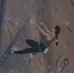
Navigation Aids Each page contains a vertical navigation bar on the left as well as a horizontal navigation table to facilitate surfing. The in-line links peppered throughout the content have the same style as the links in the navigation bars to facilitate recognition and to maintain consistency. I was worried about the a:hover having a detrimental effect on the format of the text in the paragraphs, so I used an in-line style over-ride to overcome this. Certain pages, such as the bio page threatened excessive scrolling, so I added a table of named anchors at the top of the page. Hidden Tables Although the outermost table and its first row containing two columns is visible, the vertical navigation bar on the left and the horizontal navigation bar on the bottom of each page are both constructed of hidden tables. The content section in the first row, second column (the right side) of the bio, intro, and mind games pages all contain hidden table row and table data elements. Lastly, the named anchors in the bio and mind games pages are organized in hidden tables. JavaScript Since I needed to include a variable-based script and didn't want to annoy a user (especially any of those nice women who let me photograph them at the gym!), I included the script on THIS page. Whenever the page loads, the user is prompted for a nickname. The data entered is then passed to a function which displays one of four welcome messages in the status bar. In order to vary the message, I set up an array of four strings, then used Math.random() and multiplied it by the number of elements in the array to generate a number. That function was nested inside the Math.floor function which turned that floating point number into an integer. The status bar then concatenates a string containing the user's name and a string from the array, chosen at random. Images I took all the photos myself with an ancient Kodak digital camera. Before I photographed any of the climbers included on the site, I introduced myself and asked their express permission to take pictures of them and post them on a website. The request was enthusiastically received and I left the gym that evening with nearly 100 photos. Unfortunately the quality of the photos is relatively poor. The white spots on some of the pages are caused by the presence of climbing chalk in the air. Each photgraph was resized and compressed in order to strike a balance among aesthetic appeal, instructional effect, and file size. Every image contains an alt tag, and I included the width and height attributes in order to facilitate the loading speed of the page. I used just a few photos as links. The techniques page uses a hidden table to show the photos, and each photo links the user to a page detailing the particular technique. Links I have included links in both a vertical navigation bar and horizontal navigation bar at the bottom of the page. There are names anchors which link to specific parts of long documents in order minimize excessive scrolling, and I have included links as cross-references where appropriate. All links use the same anchor style defined in the external style sheet, giving them an easily recognizable, consistent format. I have overridden the font-weight in the horizontal navigation bar and the inline links in order to avoid reformatting cells of tables and pushing adjacent text aside, which is too jarring an experience for a website that strives to be stable. My bio page contains multiple cross-referencing links. |
| Home | Intro | Techniques | MindGames | My Bio | DesignDoc |