
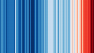
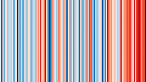
- Warming stripes (below), also known as climate stripes, climate timelines or stripe graphics, are a data visualization graphic that use a series of colored stripes to portray long-term temperature trends. They were originally created in 2018 by Ed Hawkins, a climate scientist at the University of Reading, UK and lead author of the Intergovernmental Panel on Climate Change 6th Assessment Report to be released in its entirety in 2022.
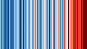
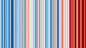
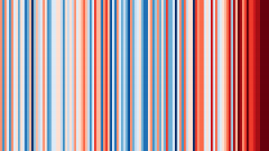
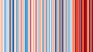
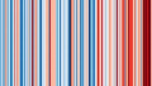
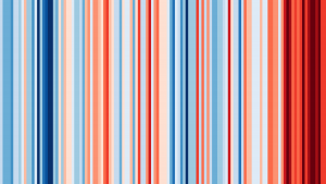
- A single stripe represents the average temperature for one year in a particular region. Stripes are displayed chronologically to show changes over time. The color of a stripe depends on whether the region’s average temperature for the corresponding year is higher (red) or lower (blue) than the region’s average temperature during the reference period (1971 to 2000). The shade of a stripe depends on whether a region’s average temperature for the corresponding year is closer to (lighter) or farther from (darker) the region’s average temperature during the reference period.
- Temperature data comes from various sources: National Oceanic and Atmospheric Administration (United States), United Kingdom Meteorology Office (United Kingdom), MeteoSwiss (Switzerland), Deutscher Wetterdienst (Germany), Météo-France International (France) and Swedish Meteorological, Hydrological Institute (Sweden) and Berkeley Earth (all other regions).
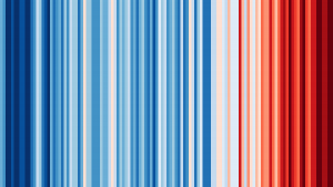
 Warming stripes. |
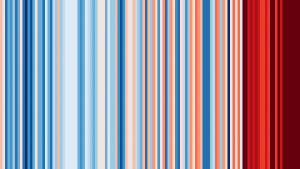
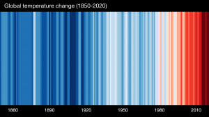 Warming stripes with years labelled. |
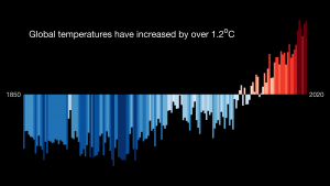 Bar graph of the global temperature changes from the year 1850 to 2020 depicted in the warming stripes. |
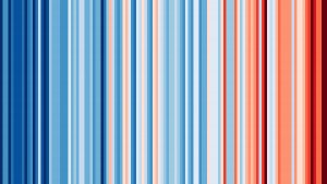
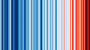
Different versions of warming stripes graphics for the world from 1850 (left) to 2020 (right). The stripes turn from mainly blue to mainly red over time, with dark red stripes having become more frequent in recent years (from Hawkins, 2018-2019).
 Africa |
 Asia |
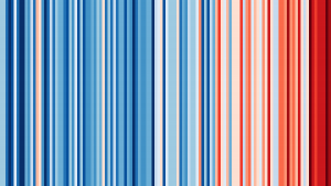 Australia |
 Europe |
 Nicaragua (representing Central America) |
 North America |
 Saudi Arabia (representing the Middle East) |
 South America |
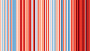
Warming stripes for the major world regions from 1901 (left) to 2020 (right). Like the warming stripes for the world, each region sees a shift from mainly blue to mainly red stripes over time. Dark red stripes have become more frequent in all of the regions in recent years, with Asia and the Middle East having particularly large bands (from Hawkins, 2018-2019).
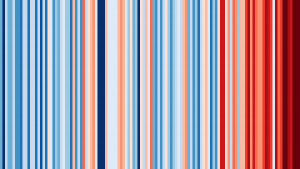
 Greenland (1901-2020) |
 Sakha, Russia (1901-2020) |
 Nunavut, Canada (1901-2020) |
 Alaska, USA (1901-2020) |
 Svalbard, Norway (1898-2020) |
 Finland (1901-2020) |
Warming stripes for regions in and around the Arctic Circle. These warming stripes contain a lot more red because they “broke the color scale” that Hawkins used for other regions due to the fact that the Arctic is warming more than twice as fast as the global average. As a result, Hawkins had to devise a different color scale specifically for these graphics (from Hawkins, 2018-2019).
How is this related to climate?
- Hawkins created the warming stripes with the intention of making visualizing climate change easier for non-scientists. Warming stripes achieve this goal by using:
- Simple, vibrant, intuitive colors with universally understood meanings.
- Blue represents cold temperatures and red represents warm temperatures. Darker shades indicate more extreme temperatures in both directions.
- A minimalistic design.
- The graphics use color alone to convey temperature trends, leaving out specific details, numbers, labels and wording that may be confusing to people who are not climate scientists.
- Simple, vibrant, intuitive colors with universally understood meanings.
- Warming stripes should not be used to compare the rate of change between locations because the color scales may be different depending on the range of temperatures within the time frame at each location. Also, not every region of the world is experiencing identical warming. The temperatures of individual countries or states may not be rising, but this does not mean that average global temperatures are not increasing. Instead, the warming stripes for local areas help tell a more nuanced story of global warming and its effects.
- These visuals are not meant to tell the entire scientific story of climate change, but are merely intended to get the conversation started in an efficient way that requires minimal scientific knowledge.
Further Exploration
- Hawkins received the Royal Society’s 2018 Kavli Medal for his work on the warming stripes in part “for actively communicating climate science and its various implications with broad audiences.”
- For the complete set of warming stripes, including those for most countries, as well as smaller regions such as US states, Canadian provinces and parts of the UK, see https://showyourstripes.info/.
References and additional resources
- Hawkins, E. Show Your Stripes. 2018-2019. https://showyourstripes.info/.
- “Warming Stripes.” Wikipedia. 2021. https://en.wikipedia.org/wiki/Warming_stripes.