As discussed in class, one of the advantages of CSS is the separation between content on presentation. It is assumed that you already know some CSS basics -- setting font, color, etc. If you want to review this, you can take a look at an older lab on the subject, and also view some of the resources and examples. For this lab we will take a single page of HTML containing Lorem Ipsum text and position elements to make it appear in different formatting styles -- first a personal blog , then a newspaper.
Blog Format
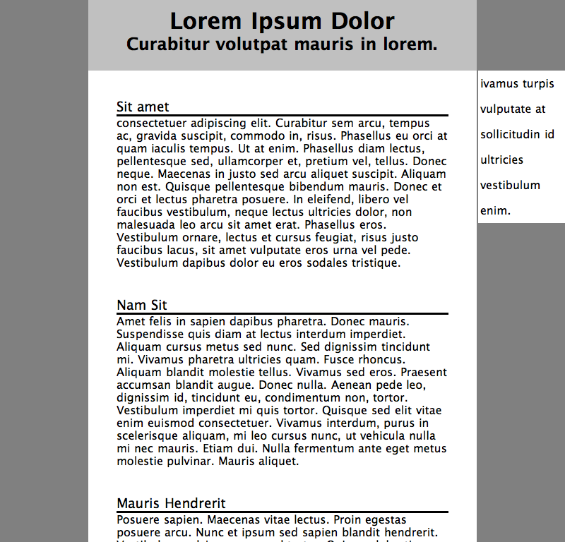
- Download layout.hml to some place where you can save and edit files, like your H: drive. Now rename it as blog.html. We are going to add a CSS to format the page to look something like the image at right.
- Create a new file called blog.css and add a link to it in the HTML file.
<link href="blog.css" rel="stylesheet" type="text/css" />
- Add the following to your new CSS file, in order. Look at the result after each addition. (If you proceed step by step, you can more easily see if you make a mistake adding material at any point, and fix any errors quickly.)
- Give the background some color and zero the margins:
body { background-color: gray; } - Now make the header silver with centered text, and make the content area white with a 1-pixel padding:
- Make the index section white, give it a fixed width, remove bullets, and adjust spacing:
#index { background-color: white; width: 123px; list-style-type: none; padding: 0; margin: 0; line-height : 4ex; }
#masthead { background-color: silver; text-align: center; } #content { background-color: white; padding: 1px; }- Alter the appearance of the section headings:
h3 { font-style: normal; font-weight: normal; border-bottom-style: solid; } - Set various margins to zero in order to condense the spacing, and add a bit of space around the index.
(Note: the commas in the top rule below separate several selectors; the styles apply to each individually as though we had written six separate rules.):
body, div, h1, h2, h3, p {
    margin: 0;
}
li {
	margin-left: 3px;
}
- Give the background some color and zero the margins:
- Now you will make some additions to these rules. To begin, set the masthead's left and right margins to 125px.
- Set the positioning of the index to be flush with the bottom of the masthead and right of the webpage (it might be a list of tags). Do you want to use absolute or relative positioning? (Hint: the content should move up to fill in the gap where the index used to be.)
- Set the contents margins to match the masthead's margins. The content should now be touching the bottom of the masthead. If it is not, you probably didn't set all the margins to zero properly.
- Move the entry's margins in so that they are easier to read (say 50px). Add padding to separate entries.
- Does it look right? Make any necessary minor tweaks.
Newspaper format
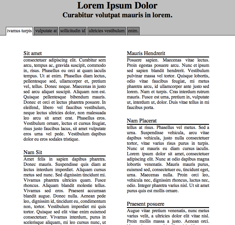
- We are now going to edit the css and html to look more like a newspaper. Begin from the results of step 3 above.
- Remove the
ulwidthsetting (or set it to auto).linormally has display: block by default - change it to inline so they will display horizontally. To make them look like tabs add the following to#index liborder-right-style: solid; border-left-style: solid; border-top-style: solid; border-top-width: 1px; border-left-width: 1px; border-right-width: 1px; padding: 3px 3px 6px; background-color: grey;and add the following to#indexborder-bottom-style: solid; border-bottom-width: 1px; background-color: silver;
to make the first tab look selected you can add the following to your css#index #first { border-bottom: 1px solid white; margin-left: 20px; background-color: white; } - Add two divs to create columns. The first div should contain the first few entries. The 2nd div should contain the rest. Make their id col1 and col2 respectively.
- You can use percentages to create and place col1 and col2
- Make col1's and col2's width the same percentage of the body's width
- Position col1 and col2 using percentages so that they appear evenly space in the window. If you make #content have position:relative, then you can position the two columns inside it.
Posting the Results
Before proceeding any farther, you should set up your account on aurora. (If you took 102, then you
probably already know how to do all this.) You should create a labs directory within the public_html directory to hold
your work for today, and transfer files from the lab to it. Then (if you haven't already done so) create an index.html file in your main
public_html folder, and include in it a link to the lab file you just uploaded. Test the file to make sure it works and is visible. (You can use these shortcut links.) Also make sure that the index.html includes your name in the title.