
How do cartographers create the allure of the “X”? This post captures the iterative process of map-making through an art history professor’s request.
The purpose of these maps is to illustrate and contextualize various types of bronze mirrors discovered at archaeological sites. While mapping technologies like LiDAR continue to transform how we envision the past, we’re using a down-to-earth, free and open-source mapping software, QGIS, to visualize the professor’s research. The previous version consisted of a collection of maps that portrayed each major mirror type and its subtype (think Data Driven Pages). Since each site can contain multiple types of mirrors, this presented a symbology challenge that can’t be solved by varying the hue alone. The solution was to customize marker symbols to have dual colors. 
Over a Zoomful meeting, we settled on these initial criteria for the new maps:
- #1 – a map showing the distribution of the major mirror types and its subtypes
- Color symbology: IA1=dark blue, IA2=light blue; IB1=red, IB2-pink; IIA1= black, IIA2=light grey; IIB1=orange, IIB2=light yellow
- Grayscale terrain basemap
- The locations of the mirrors, provided as a .csv (comma delimited text file) with key attributes of longitude and latitude. (Here’s the guide on how to prepare your own x, y data)
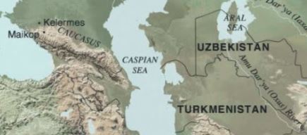
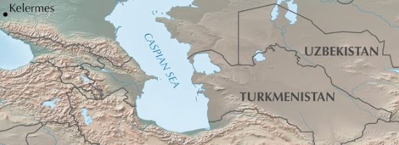
- #2 – an inset map of the Eastern Eurasian Steppe that resembles this cropped example
- With additional placenames and natural features provided as a list
For map #1, we first need to convert the tabular data into a spatial layer of points. We also need ancillary data such as administrative boundaries and a shaded relief for a grayscale terrain basemap. These were downloaded from Natural Earth.
In a new QGIS project, import and symbolize the data. We’re focusing on the mirrors in one province, so the boundary is outlined using a drop shadow for a subtle contrast against the basemap.
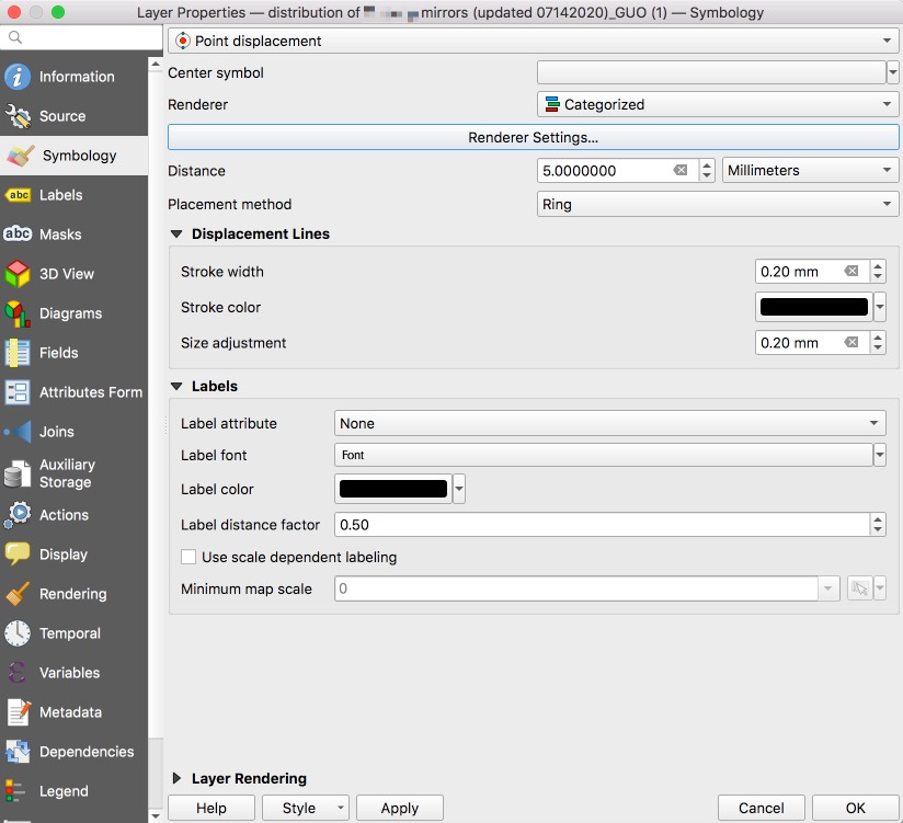
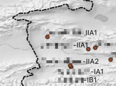
Some sites have more than two types of mirrors, which means overlapping points. To circumvent this problem, I experimented with the point displacement renderer that takes the points that fall in the same location and essentially creates an orbit around the site center. ![]()
The labels become similarly unruly with overlapping points, so I exported a version without any text and labeled in Adobe Photoshop. The following is a before and after:

A traditional workflow would be to use the print layout, then export your final map in high resolution (at least 300 dpi)
For map #2, we can obtain all the layers from Natural Earth – country boundary lines (inland), physical labels, and the cross-blended hypsometric tints raster. I used the list provided to query the countries and natural features, and created a similar x, y table for any missing cities. (You can get the latitude/longitude for a place using a finder like this, or google maps.) The rest of the work involves wrangling label placement, hierarchy, and “dimming” the basemap using transparency. Yet another before and after:
There are, of course, many drafts and feedback in between. And that is how “X” marks the spot.
