Food for thought over the weekend: a state-by-state map of the highest-paid public employees.
(via Deadspin – click map to enlarge)
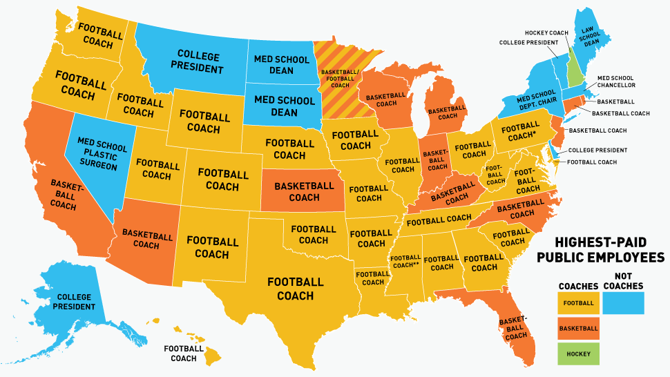
This map is a great example of why maps are an efficient way to communicate data. Could this data be visualized using a bar graph, or a pie chat? Yes. Absolutely. But putting it on the map allows the author to generally represent the relative frequency of “basketball coach,” “football coach,” and “not coaches” as the highest paid public employees (oh, and hockey coaches– stay independent, Vermont!), while also allowing readers to have fun examining regional patterns, and shedding light on the individual character of certain states. For example, I was interested to note that in a sea of Big 12 football dominance, Kansas stands out as a “basketball” state– fitting, considering the continued prominence of Jayhawks Basketball, and Bill Self’s unofficial role as “State Cool Uncle.” Similarly, many states whose major public institutions are not known for their sports prowess have powerful college administrators taking home the biggest paycheck, and there seems to be a spatial factor to these locations of these blue parts of the map, as they appear in several notable clusters.
The whole Deadspin article is well worth reading. I leave you with two other thoughts: first, who would have thought that so many Big Ten schools would lean toward basketball? And, go Tar Heels.