Today we'll be working with data containing historic price information on homes in Massachusetts from Zillow. You can start by downloading the dataset here (note: this is an Excel file, rather than a CSV; if you prefer, you can look at other states here).
Check out a couple of the columns to see what's in there, and then create a new sheet.
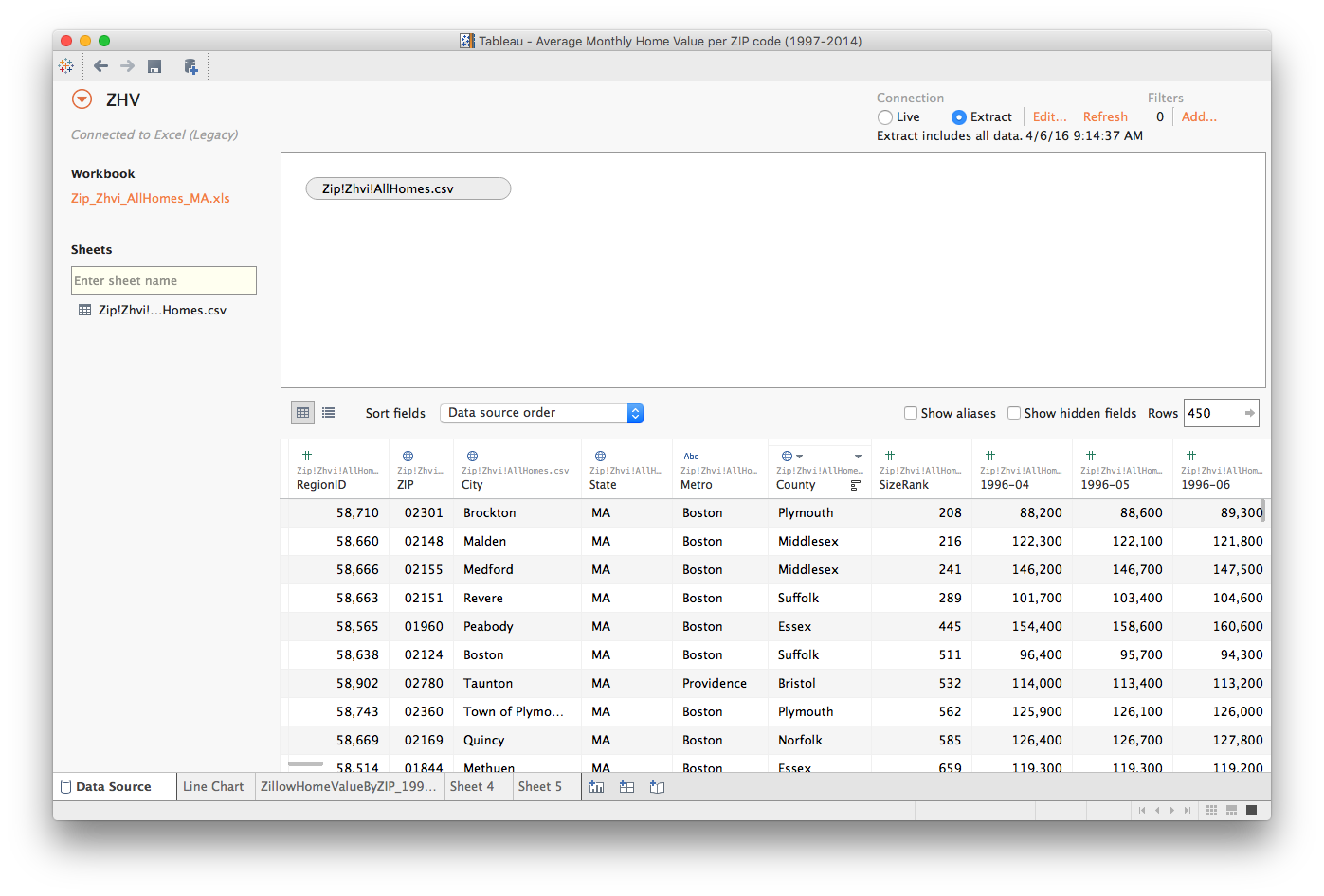
Note that this dataset has a separate column for each of the 239 months covered:
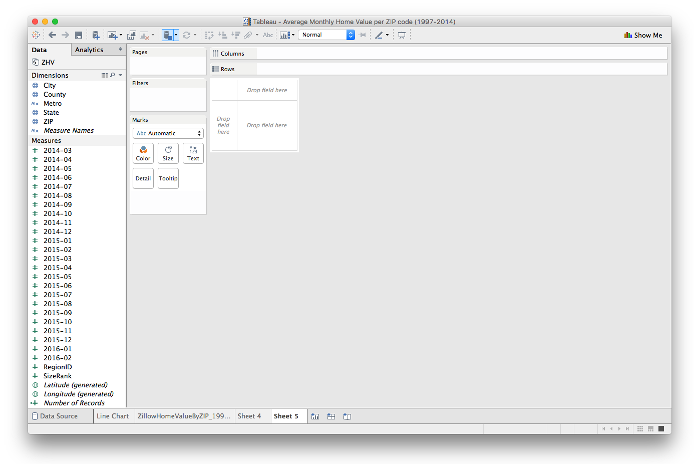
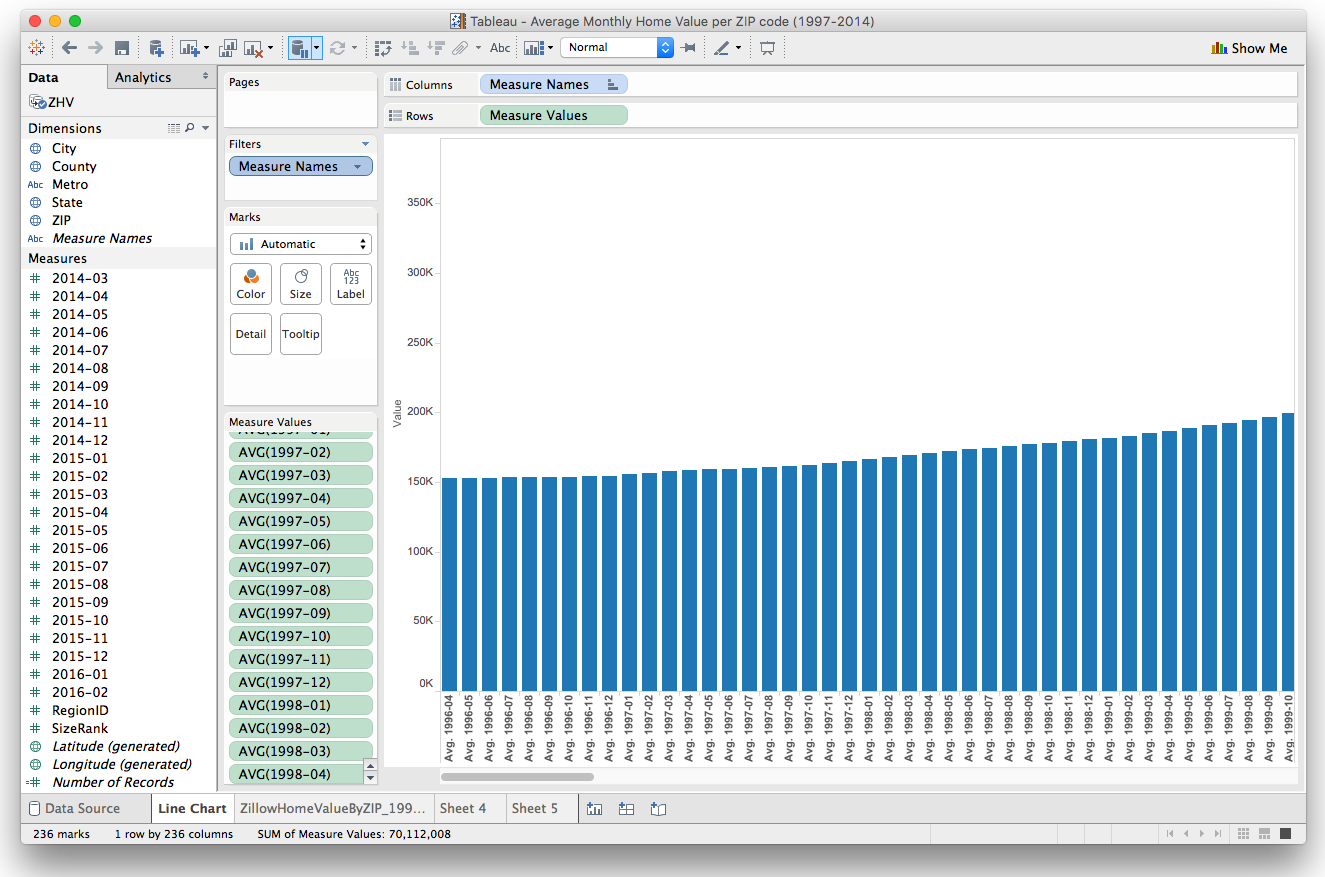
If we drag the Measure Names dimension onto the Columns shelf and the Measure Values measure onto the Rows shelf, we get a rather unweildy bar chart showing the increase in home prices over time. If we change the aggregation measure from Sum() to Avg(), we can better control for houses being built or demolishes over the years:
But since there's a strong geographic component here, we'd really like to be able to visualize this change on a map.
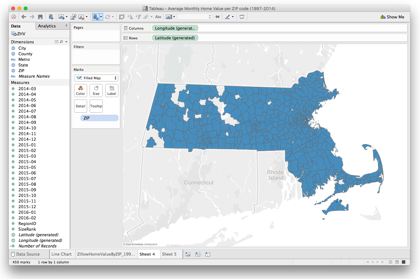
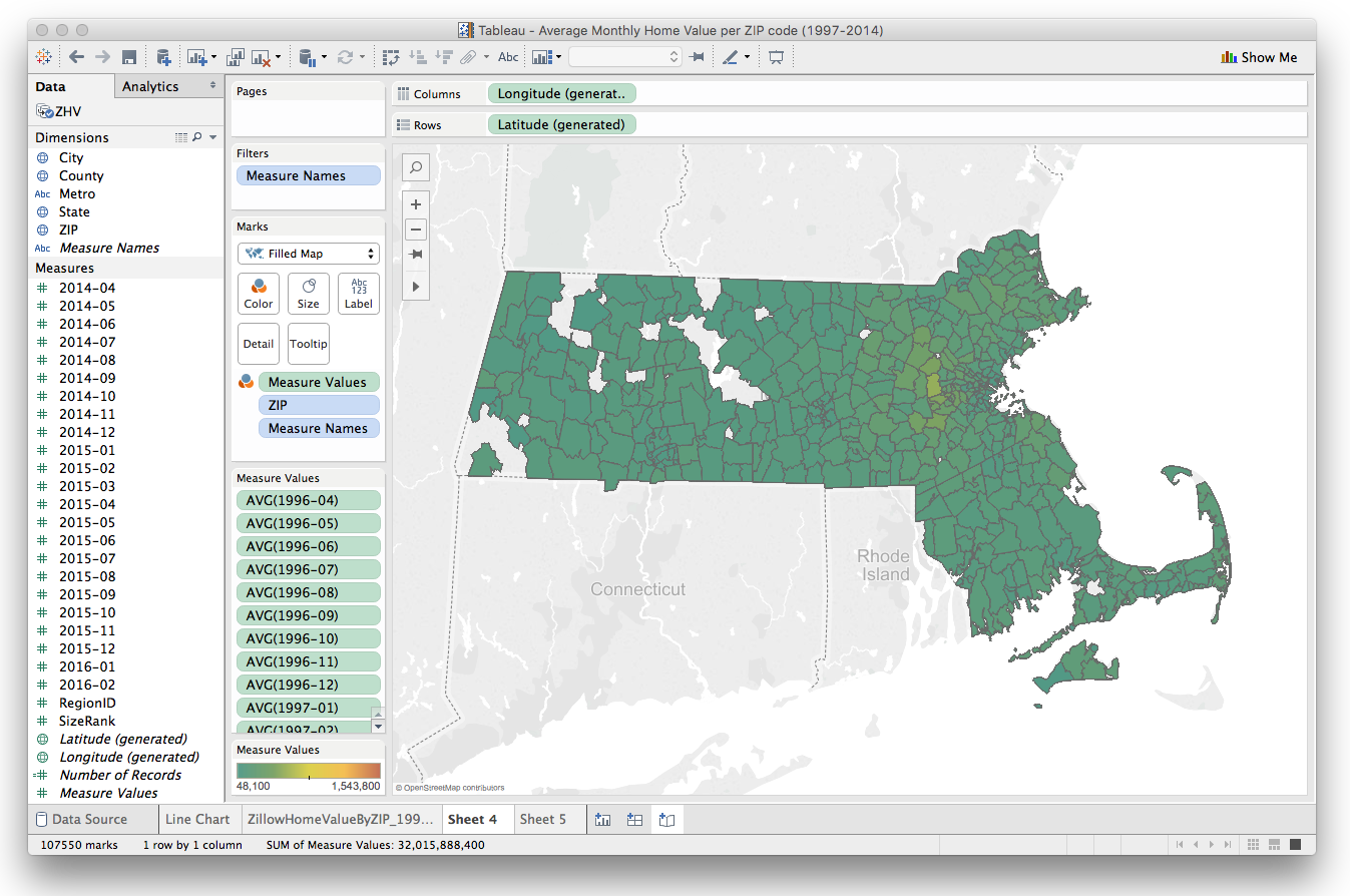
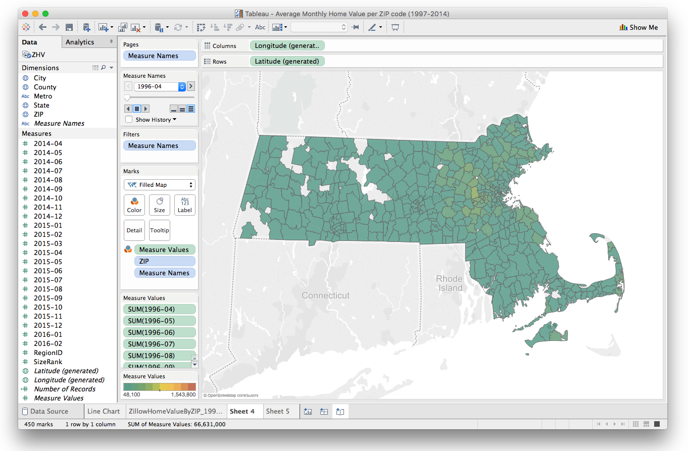
Let's create a new sheet, and drag the Longitude (generated) measure onto the CXolumns shels and the Latitude (generate) measure onto the Rows shelf. We'll also want to draw the ZIP dimension onto the Detail mark:
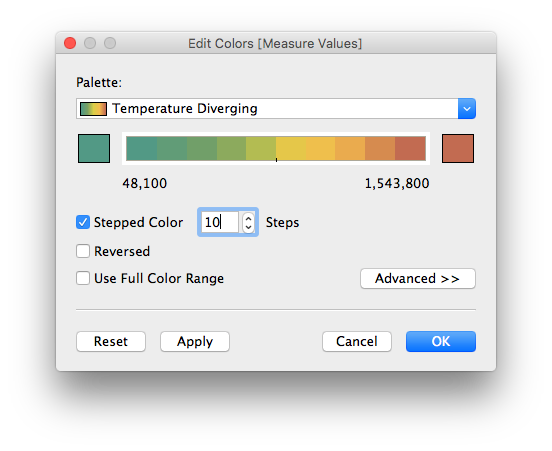
Let's make a custom color palette with 10 steps:
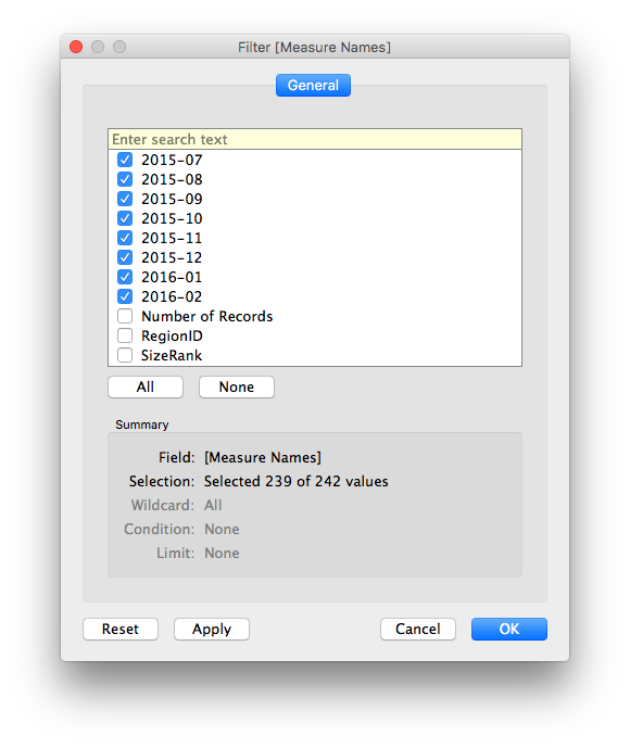
and get rid of some of the fields we aren't using right now by filtering on Measure Names:
Now when we drag the Measure Values measure onto the Color mark, we get a pretty classy looking filled map:
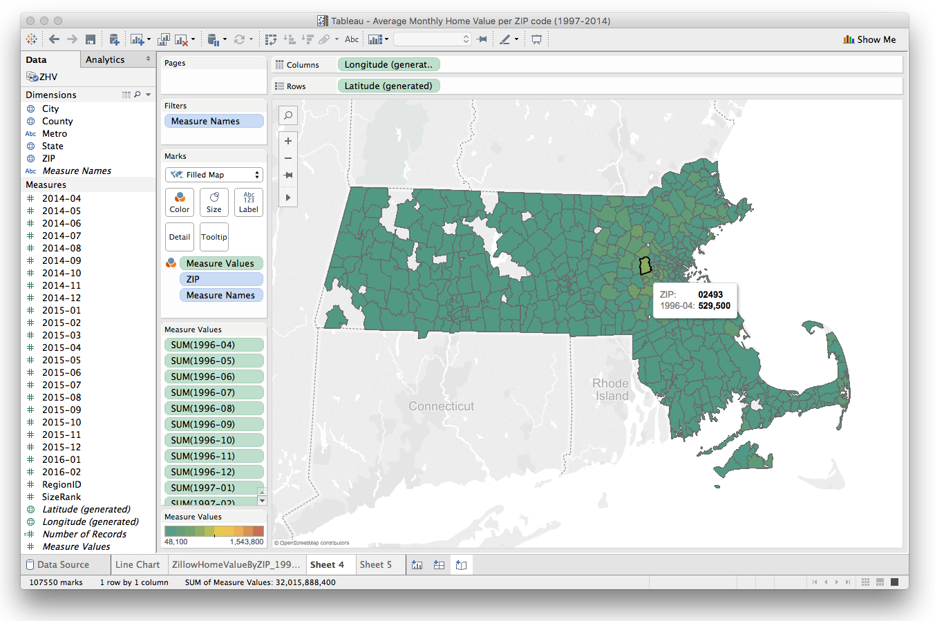
Unfortunately, it's only showing us one month at a time:
Not to worry! We can use Tableau's Pages feature to make series of views, one for each month, and then animate them. Try dragging the Measure Names dimension onto the Pages box in the upper left corner:
Now when you hit the Play button, you'll be able to step through each month and see the change in average home prices in Massachusetts over time: