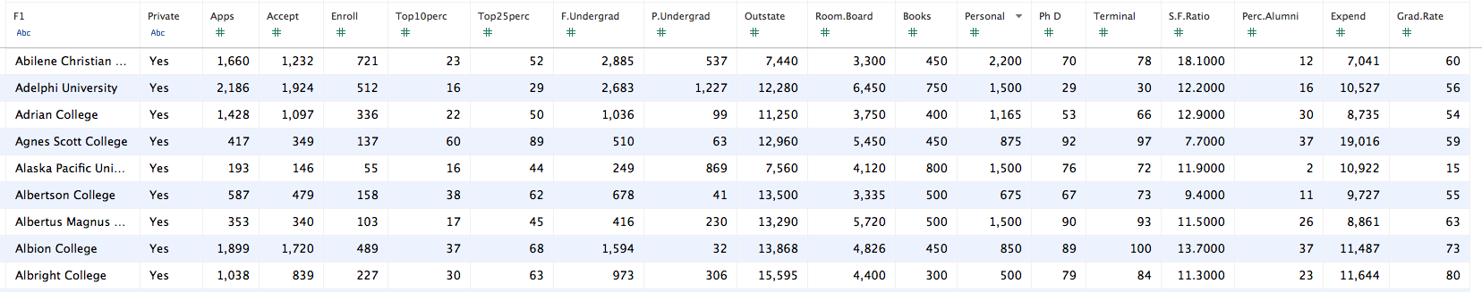
Start by loading the CSV file containing the College dataset into Tableau. Recall that its dimensions look something like this:
- Private - a factor with levels No and Yes indicating private or public university
- Apps - number of applications received
- Accept - number of applications accepted
- Enroll - number of new students enrolled
- Top10perc - % new students from top 10% of H.S. class
- Top25perc - % new students from top 25% of H.S. class
- F.Undergrad - number of full-time undergraduates
- P.Undergrad - number of part-time undergraduates
- Outstate - out-of-state tuition
- Room.Board - room and board costs
- Books - estimated book costs
- Personal - estimated personal spending
- PhD - % of faculty with PhDs
- Terminal - % of faculty with terminal (Master's) degree
- S.F.Ratio - student/faculty ratio
- perc.alumni - % alumni who donate
- Expend - instructional expenditure per student
- Grad.Rate - graduation rate
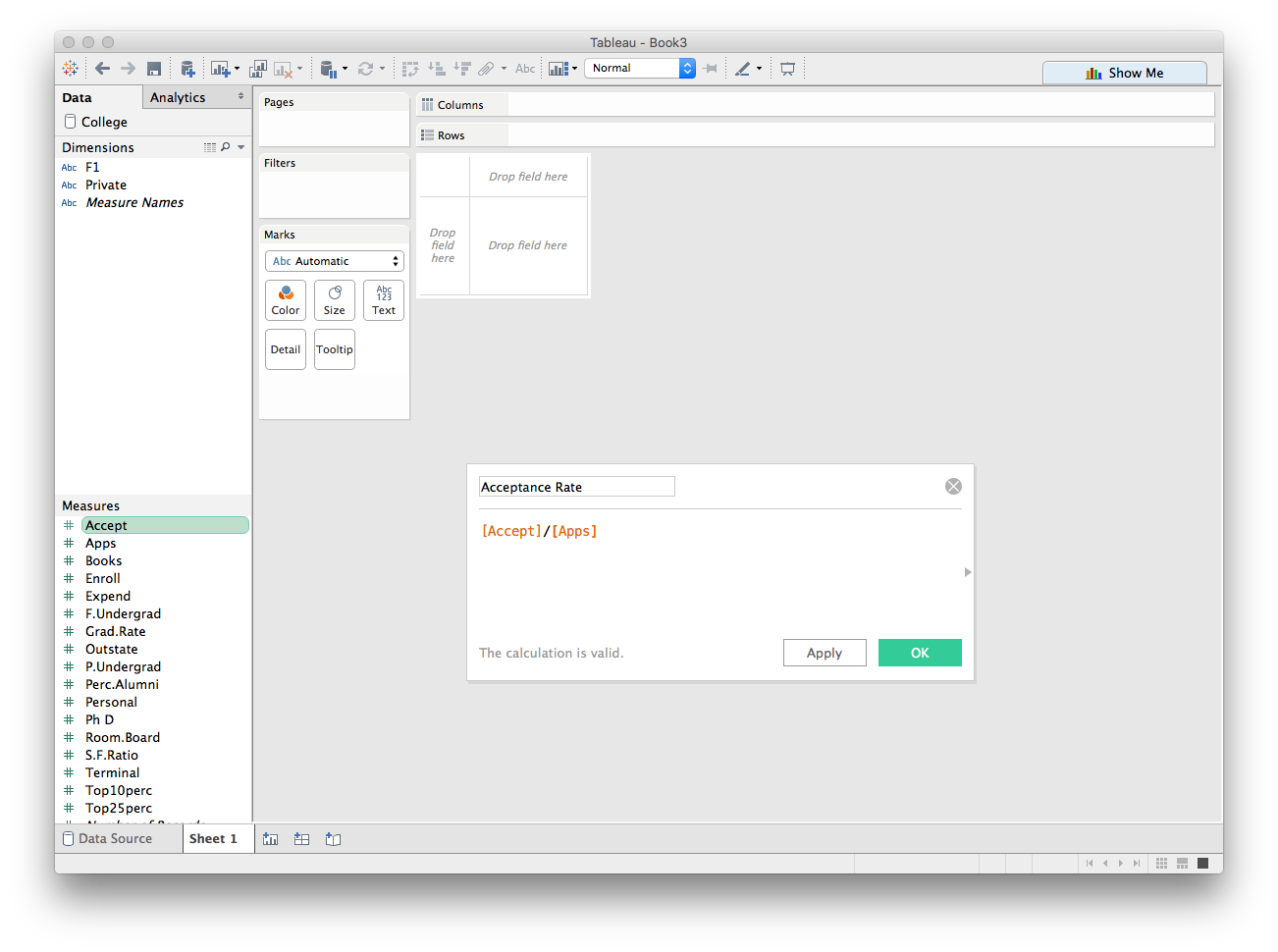
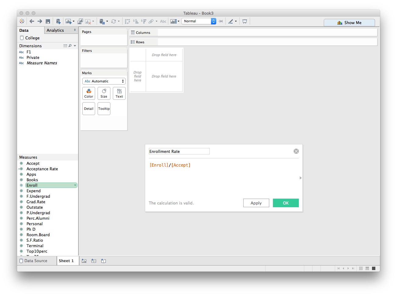
We'll start by creating two Calculated Fields: Acceptance Rate and Enrollment Rate (remember how?)
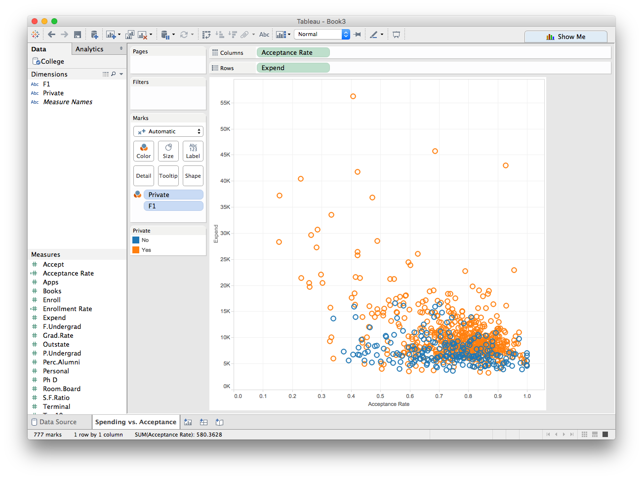
Next, we'll create a scatterplot comparing Acceptance Rate to Expend (the amount each institution spends per student). We'll drag the Private dimension onto the Color mark to help us differentiate between public schools and private schools, and drag the F1 dimensions (which contains the school's name) onto the Tooltip mark, so we can see it when we hover over each point. To rename the sheet, right click on its name on the bottom of the screen.
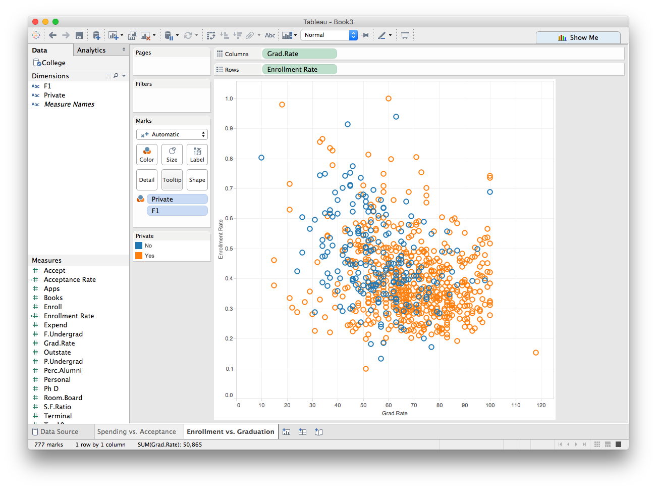
Now we'll create a second scatterplot comparing Enrollment Rate to Grad.Rate. Create a new sheet by clicking on the icon on the bottom of the screen that looks like a histogram with a '+' on it, and repeat the process from step 4.
Now, to combine our sheets! Create a new Dashboard by clicking the middle icon on the bottom of the screen that looks like a page divided into quarters with a '+' on it:
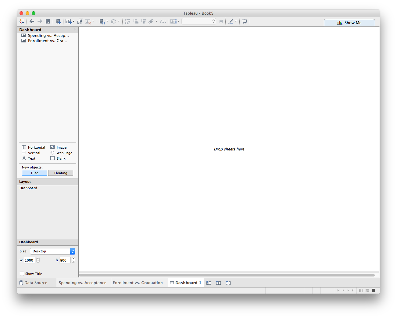
Notice that the two sheets you created are listed in the upper left.
Drag both of your sheets onto the dashboard. Resize them so they are equally sized.
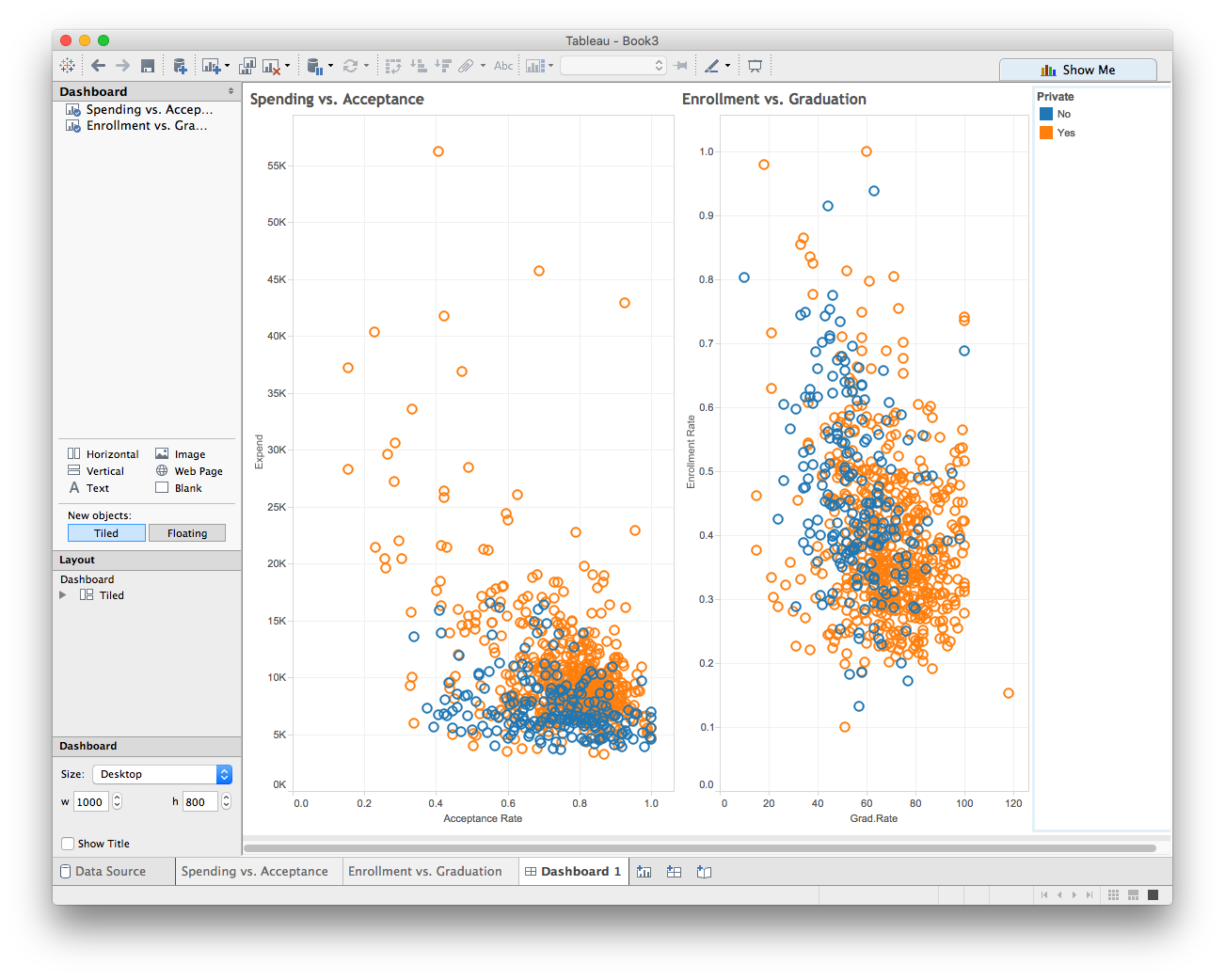
That little legend is taking up a whole lot of space, but we don't want to delete it entirely. Instead, we'll allow it to float on top of the dashboard.
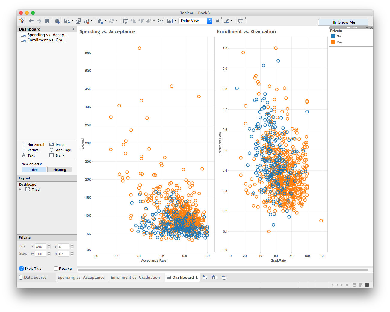
Click on the legend to select it, and then check the Floating checkbox under Private in the lower left corner of the screen:
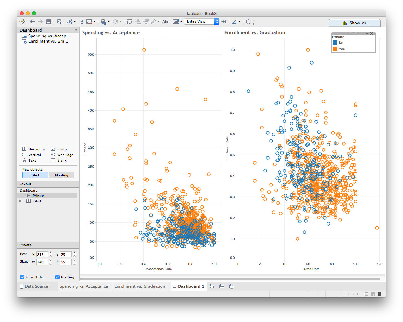
Much better!
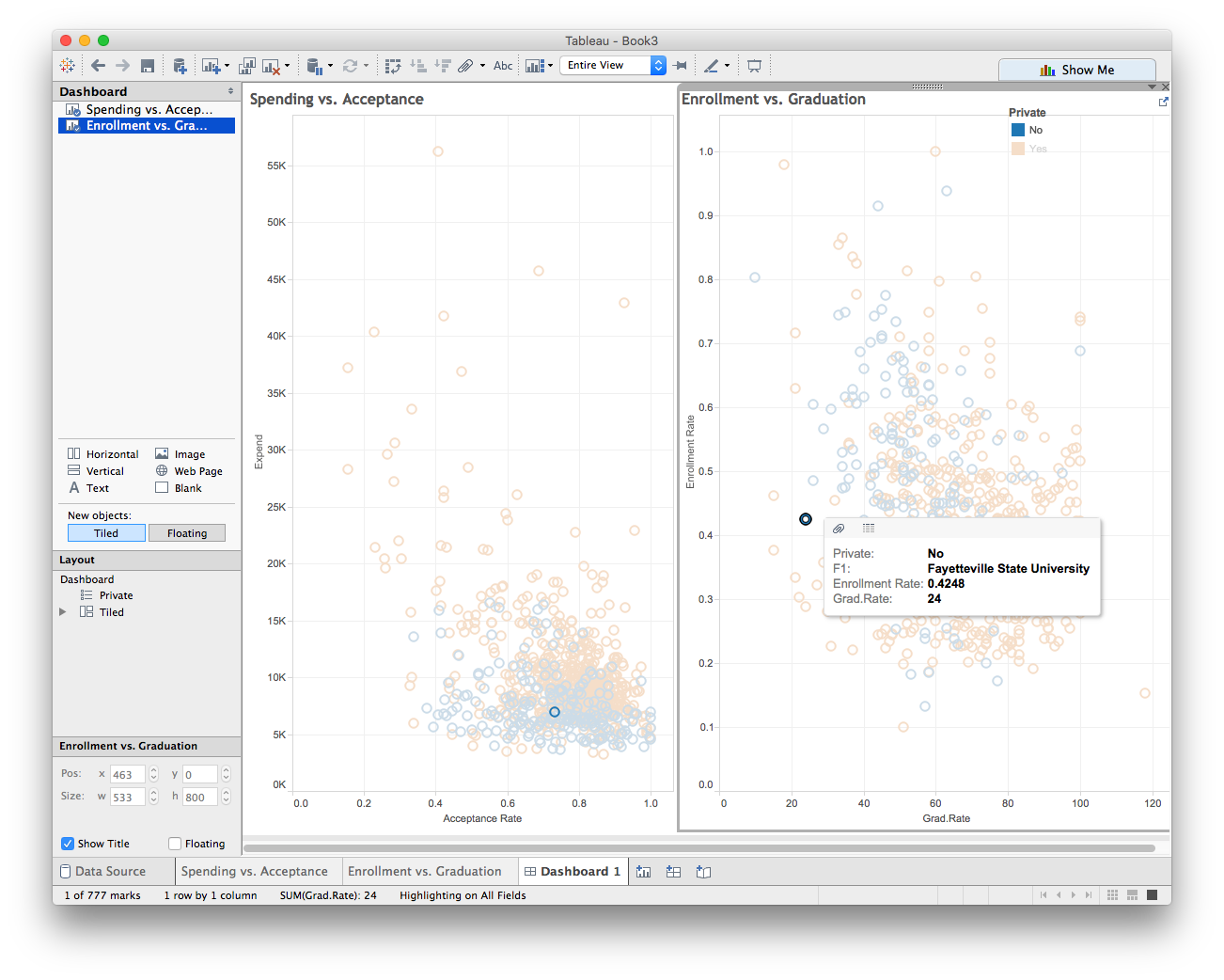
Now, notice what happens if you select a point in one of the scatterplots:
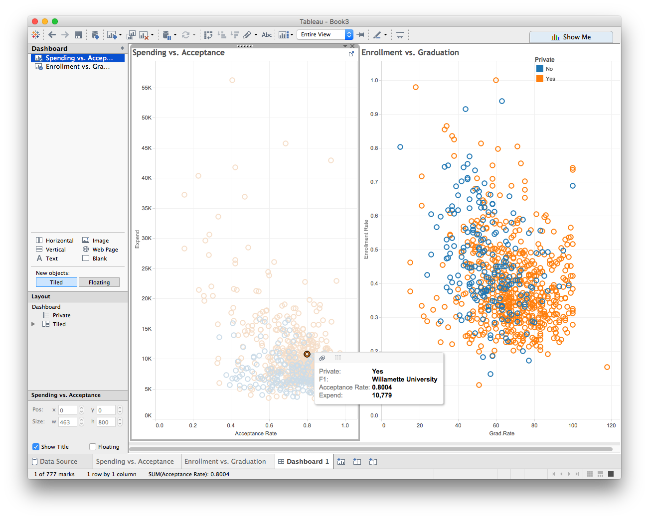
The point is highlighted and details of that point show up... but shouldn't a related point also appear in the other scatterplot? It would be nice if the visualization indicated that to help us compare more easily. No, problem, we just need to tell Tableau what to do!
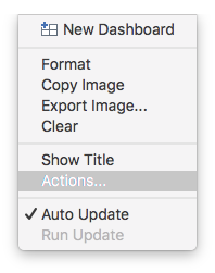
We can accomplish this using Actions. To create an action, select Dashboard>Actions... from the menu:
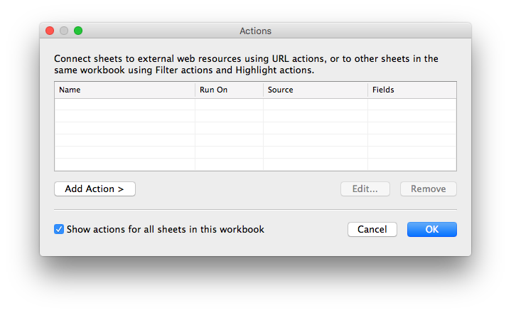
This will bring up the Actions dialog box. Notice how it is currently empty?
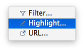
Let's tell Tableau to highlight points in both scatterplots whenever we select a point in either one. Click on the Add Action > button, and select Highlight...:
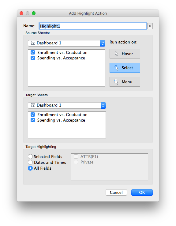
This brings up the Add Highlight Action dialog box. Make sure that both sheets are selected under both the Source Sheets and Destination Sheets sections, and that we've chosen Run action on: Select.
Now when we return to the dashboard, we see that selecting a point in one scatterplot causes the corresponding point in the other scatterplot to be highlighted as well:
You can click and drag to select multiple points as well. For example, we might want to explore what's going on with the schools that appear to be outspending everyone else:
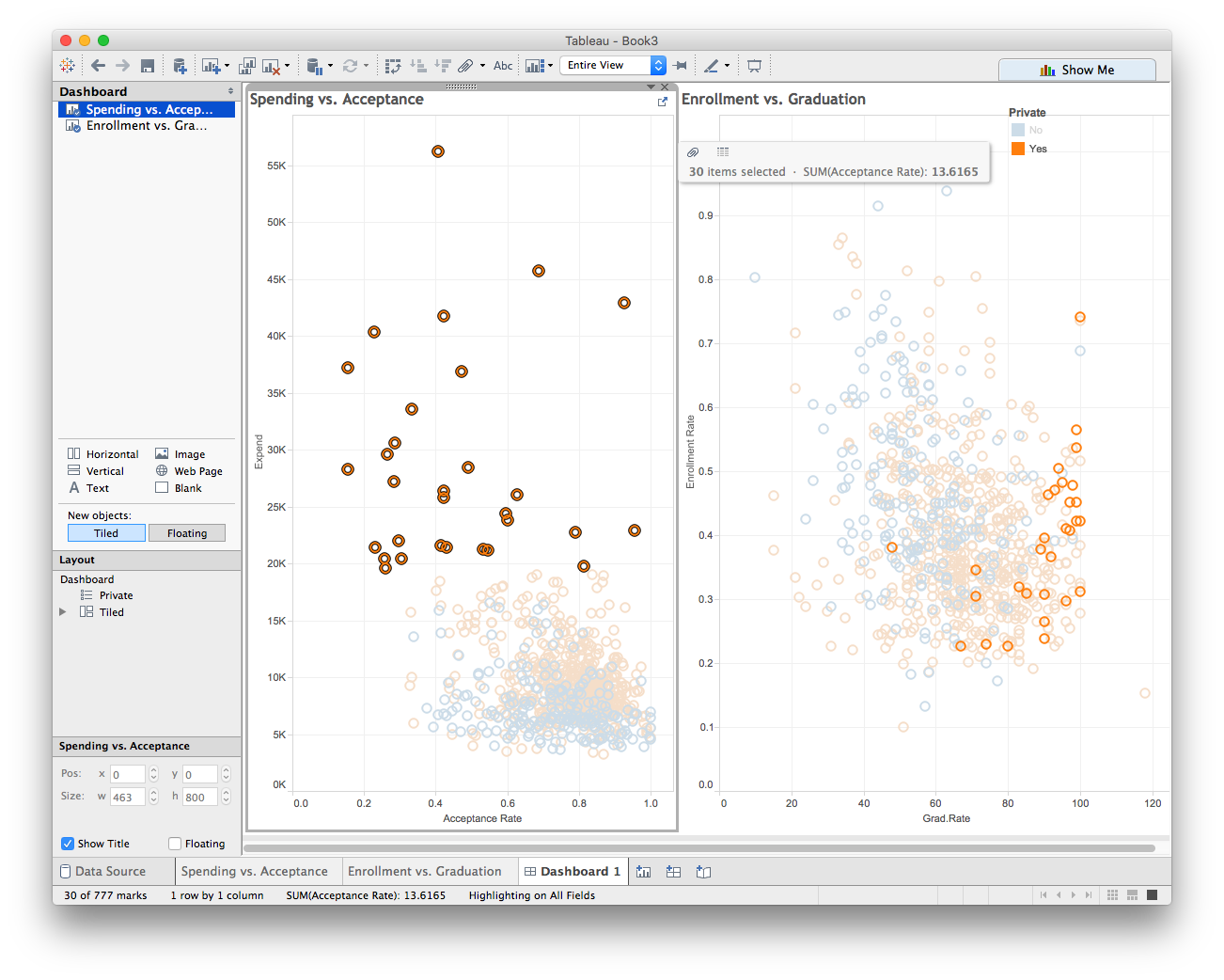
How interesting: they tend to have higher graduation rates as well!
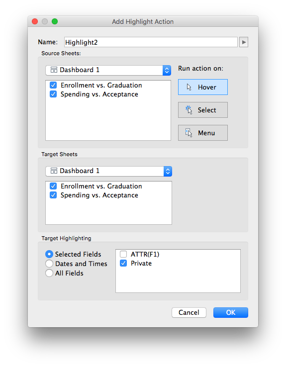
Now let's add a second action to help us distinguish between public and private schools. This time, we'll use Target Highlighting to highlight only those points with a matching value in the Private field, and we'll run the action on Hover:
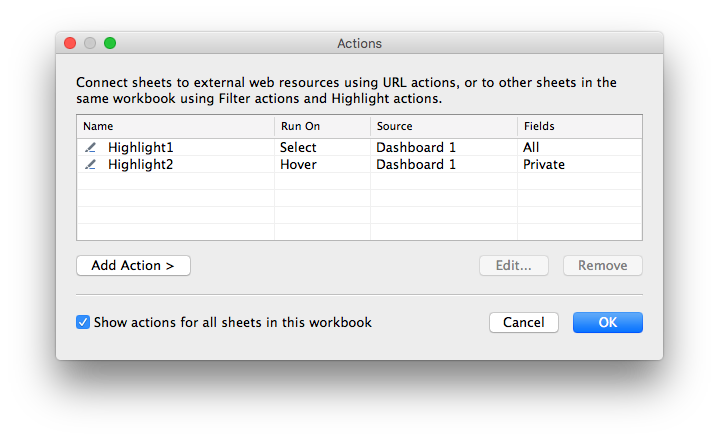
Now we have two actions:
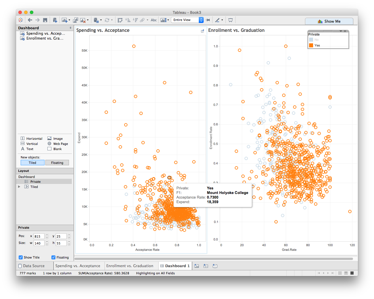
When we hover over a private school, all other private schools are highlighed as well (and similarly, public with public):
To get credit for this lab, reply to the questions posted to Piazza.