Throughout the lab, you'll occasionally see questions marked with an asterisk ('*'). To get credit for this lab, you'll post your answers to Piazza.
Lab 4 pt. 1: SPLOMs
Scatterplot matrices are a useful tool to help visualize relationships between multiple quantitative (numerical) variables.
In Tableau, you create a scatterplot matrix by placing multiple measures on the Columns and Rows shelves. Today, we'll create a scatterplot matrix comparing five dimensions
Start by downloading the CSV file containing the College dataset, which contains statistics for a large number of US Colleges from the 1995 issue of US News and World Report.
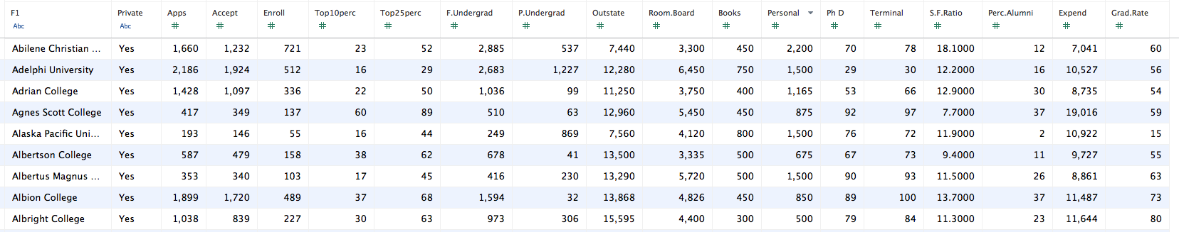
Load the dataset into Tableau and explore the dimensions, which look something like this:
- Descriptions for each of the dimsensions are below:
- Private - a factor with levels No and Yes indicating private or public university
- Apps - number of applications received
- Accept - number of applications accepted
- Enroll - number of new students enrolled
- Top10perc - % new students from top 10% of H.S. class
- Top25perc - % new students from top 25% of H.S. class
- F.Undergrad - number of full-time undergraduates
- P.Undergrad - number of part-time undergraduates
- Outstate - out-of-state tuition
- Room.Board - room and board costs
- Books - estimated book costs
- Personal - estimated personal spending
- PhD - % of faculty with PhDs
- Terminal - % of faculty with terminal (Master's) degree
- S.F.Ratio - student/faculty ratio
- perc.alumni - % alumni who donate
- Expend - instructional expenditure per student
- Grad.Rate - graduation rate
Let's try dragging the Apps, Accept, and Enroll measures onto both the rows and columns shelves to see how they relate to one another. Don't forget to turn off Analysis>Aggregate Measures!
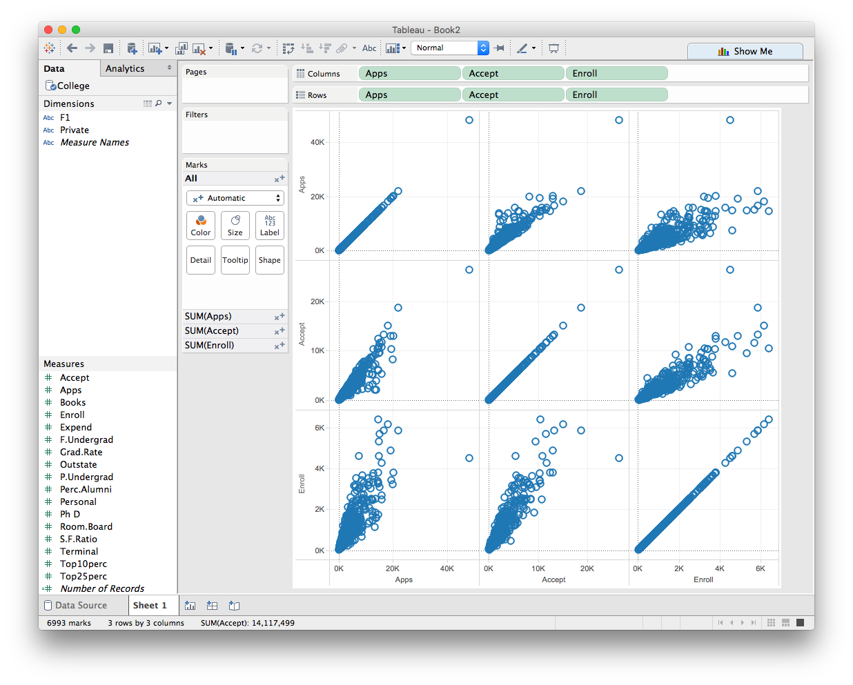
Notice that there is a positive correlation between all pairs of these variables. This makes sense: colleges that receive large numbers of applications may in fact be larger institutions overall, and so would be likely to accept more students. Similarly, an institution that accepts more students intuitively would have a larger number of students enroll.
Bear in mind: these are absolute comparisons, meaning we are looking at the actual number of students, rather than a percentage.
*Piazza Q1:* Create calculated fields to convert the accept and enroll measures to percentages:
- calculate Accept % using (Accept)/(Apps)
- calculate Enroll % using (Enroll)/(Accept)
Now create a SPLOM using these measures. What is different?
Lab 4 pt. 2: Parallel Coordinates
Parallel coordinates is a common way of visualizing and exploring high-dimensional, multivariate data. While Tableau unfortunately doesn't directly support Parallel Coordinates, we'll use a little bit of magic to convince it to do our bidding.
We'll start by dragging the Measure Names dimension onto the Columns shelf, and the Measure Values measure onto the Rows shelf. If we turn off Analysis>Aggregate Measures, we get something that looks like this:
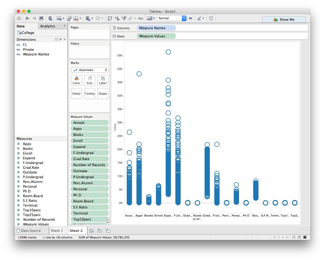
Each dimension appears as its own column along the bottom, and its values are arranged along the vertical axis. Good!
- If we switch from Automatic marks to Line, we get something like this:
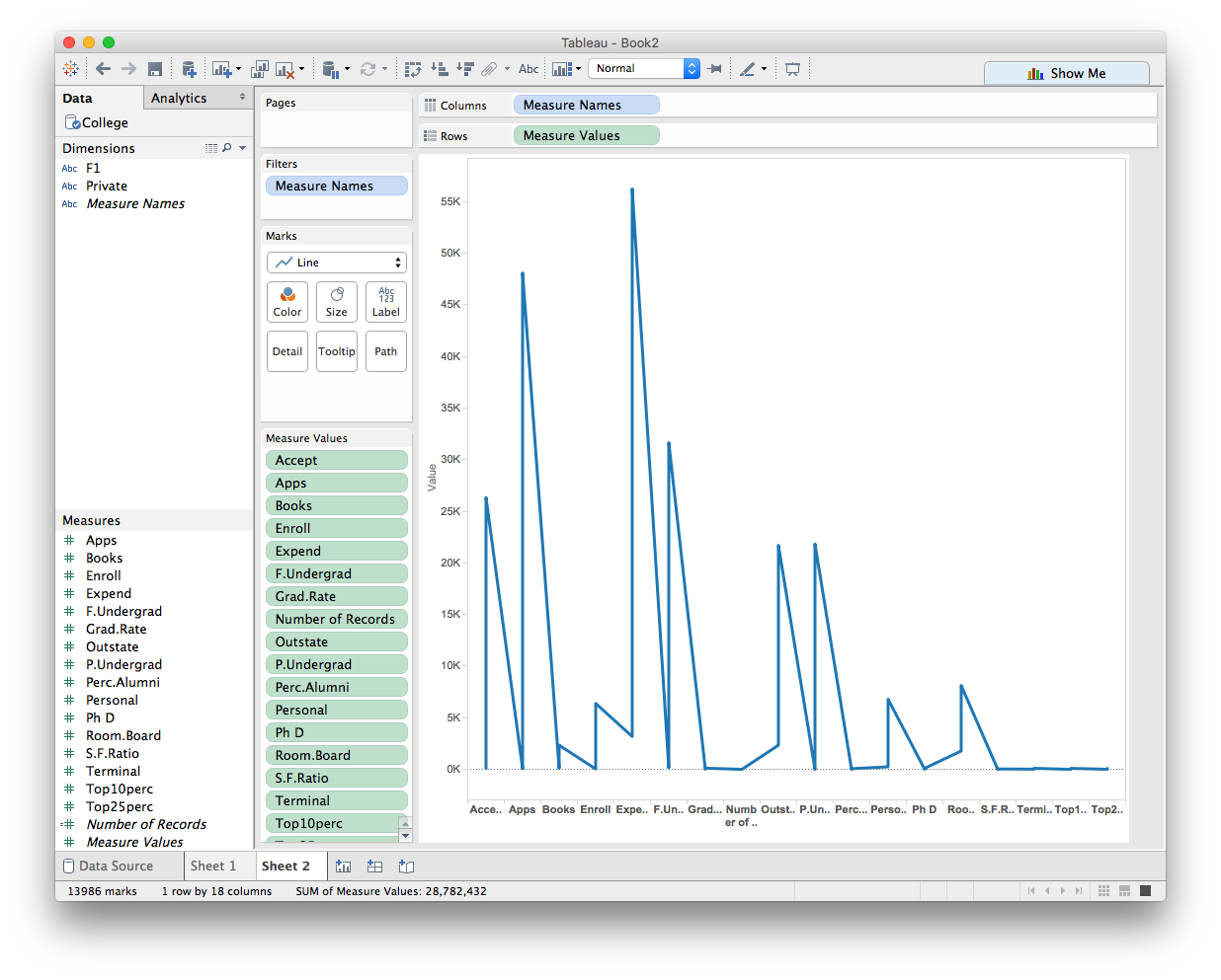
Uh-oh! We wanted an individual line for each observation. To tell Tableau draw them separately, we can drag a unique identifier onto the Detail mark. In this case, we'll use the F1 dimension, which contains the name of each college:
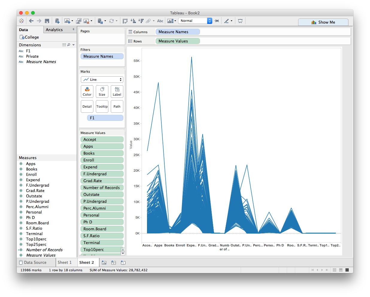
That's better, but we've got another problem: Tableau is mapping all our variables to a single vertical axis, which is the wrong scale for most of them. Because Tableau doesn't understand that we want a separate scale for each column, we'll have to trick it by scaling the data instead.
We can do this by creating a Calculated Field for each of the dimensions we want to include in the parallel coordinates plot that goes from 0 to 100 (think of this as a percentage of the total range). To do this for a variable called X, we'll use the following formula:
- 100 * (AVG([X])-TOTAL(MIN([X]))) / (TOTAL(MAX([X]))-TOTAL(MIN([X])))
*Piazza Q2:* Create calculated fields to convert several of the measures in the College data set to percentages using the formula above. Next remove the unscaled measures from your parallel coordinates plot, leaving only the ones with a common 0-100 scale. What is different? What patterns do you notice?