Parts 1 and 2 of this lab are adaptations of Tableau Software's Build-It-Yourself Examples. Throughout the lab, you'll occasionally see questions marked with an asterisk ('*'). To get credit for this lab, you'll post your answers to Piazza.
Scatterplots are a useful tool to help visualize relationships between quantitative (numerical) variables.
In Tableau, you create a scatterplot by placing at least one measure on the Columns shelf and at least one measure on the Rows shelf. Today, we'll create a simple scatterplot comparing just two dimensions at a time.
A scatterplot can use several mark types. By default, Tableau uses the standard shape mark type, a hollow circle. Depending on your data, you might want to use another mark type, such as a circle or a square. For more information, see Mark Types.
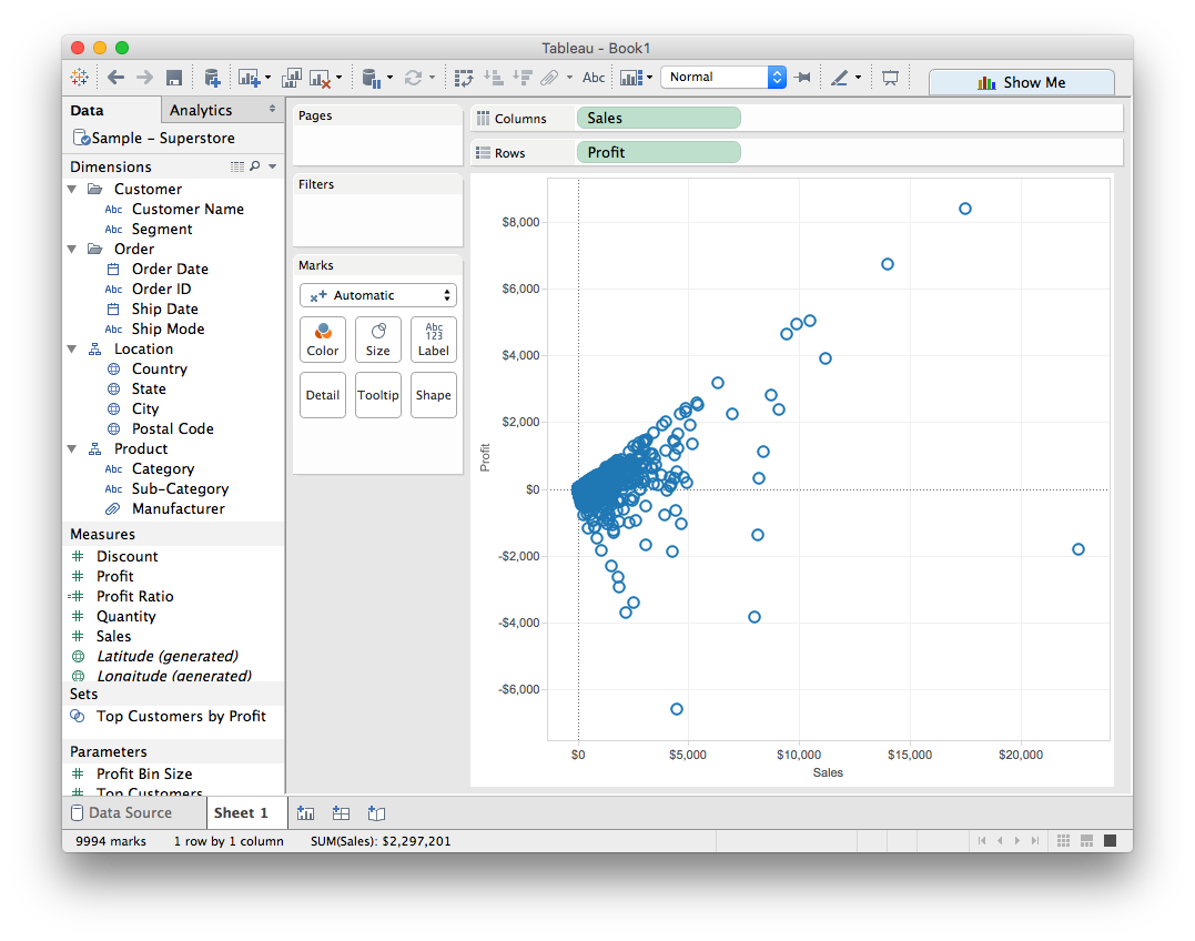
Let's create a scatterplot to compare sales to profit in the Superstore dataset:
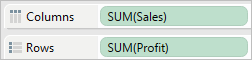
Drag the Sales measure to Columns.
Tableau aggregates the measure as a sum and creates a horizontal axis.
Drag the Profit measure to Rows.
Tableau aggregates the measure as a sum and creates a vertical axis.
Recall that measures contain continuous numerical data. When you plot one quantitative value against another, you are comparing two numbers. The resulting chart is just like a plot you may have seen in a math class, with x and y coordinates.
Now you have a one-mark scatterplot:
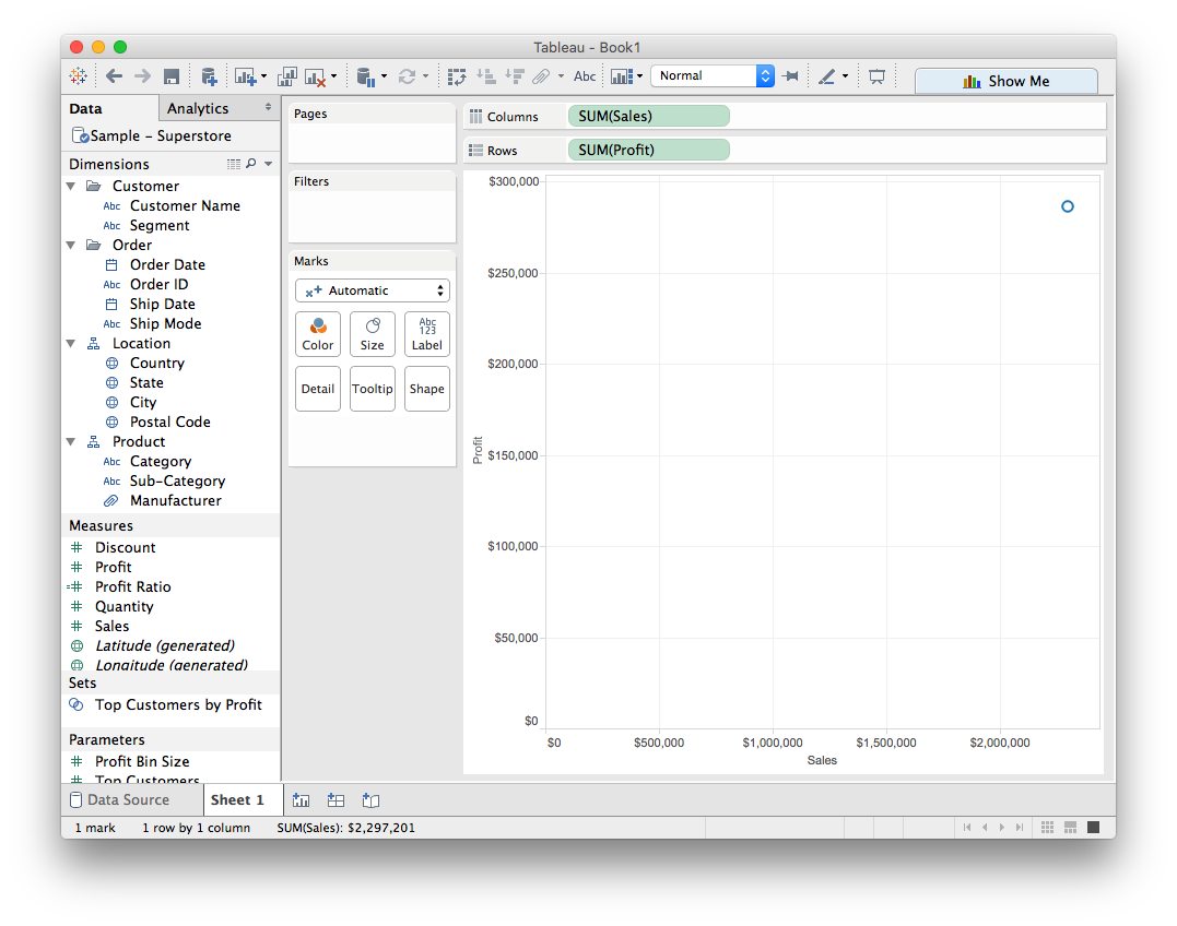
This initial view is a little disappointing — a single mark, showing the sum for all values for the two measures. Again, this is because the measures were automatically aggregated as sums. The default aggregation SUM() is indicated in the field names. If we hover over the single point in the chart, the values shown in the tooltip show the sum of sales and profit values across every row in the data source.
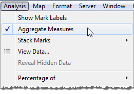
Let's see what happens if we disaggregate the data. To do this, we'll go to Analysis >Aggregate Measures and de-select.
Violá! Now you see a lot of marks--one for each row in your original data source:
It's a little hard to tell what's going on in that clumpy spot. Maybe it would help to separate the data according to whether it was in the Consumer, Corporate, or Home Office segments. We can do that by dragging the Segment dimension onto one of the visual dimensions in the Marks card. I'll use color:
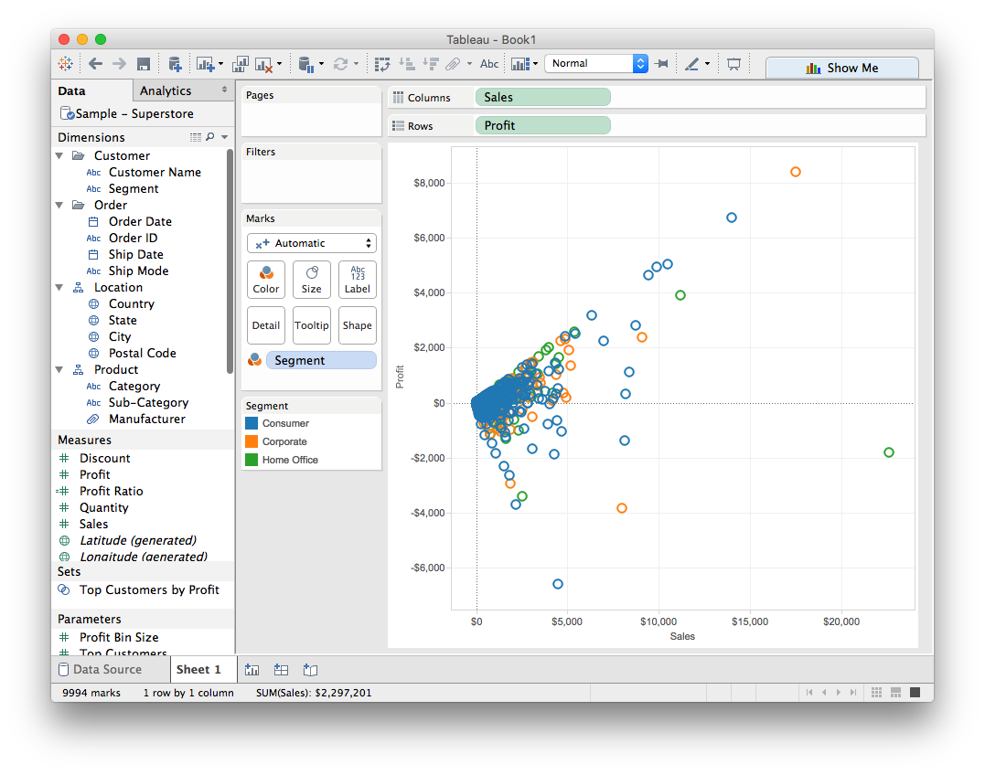
Hmm, no discernable pattern there. Let's try a different measure, Product Category:
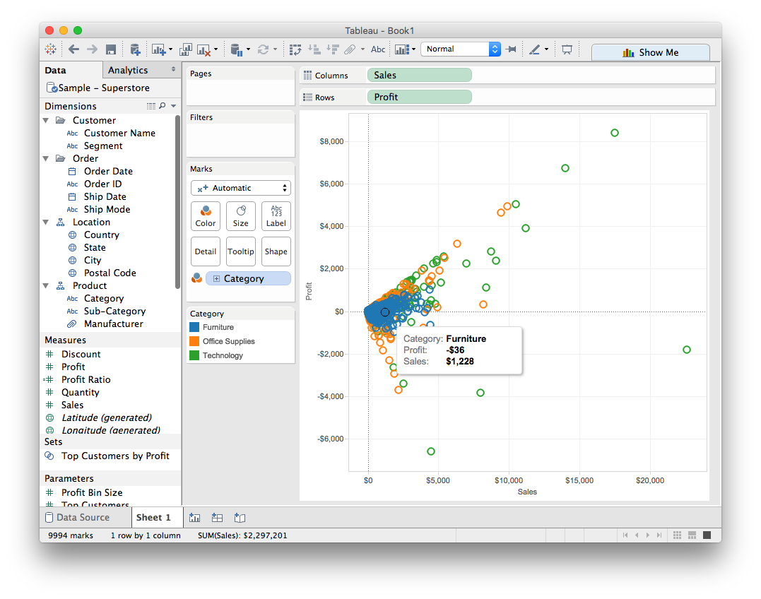
That's interesting! *Piazza Post pt. 1*: What do you notice about the Furniture category?
Sometimes it's useful to capture our intuitions about the relationships we're seeing mathematically. A trend line can provide a statistical definition of the relationship between two numerical values. To add trend lines to a view, both axes must contain a field that can be interpreted as a number—by definition, that is always the case with a scatterplot.
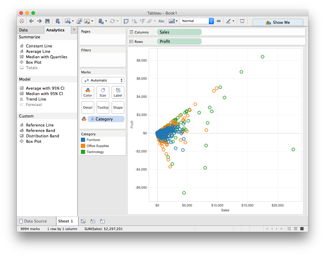
To add a trend line, first we'll switch to the Analytics tab on the lefthand side of the screen:
Under the
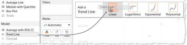
This produces three trend lines, one for each of the Product Category types:
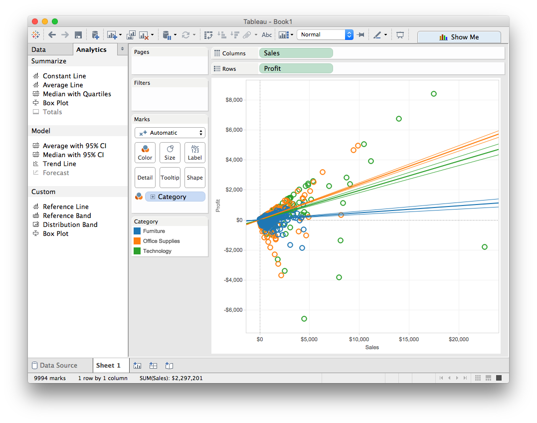
You'll notice that each of the lines has two fainter lines surrounding it. These are called confidence bands, and they indicate how sure we are about the position of the line. You'll learn more about how this is calculated in more advanced data science courses. For now, we can turn them off to de-clutter the visualization.
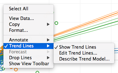
To remove the confidence bands: right-click (control-click on Mac) in the view and choose Trend Lines > Edit Trend Lines.
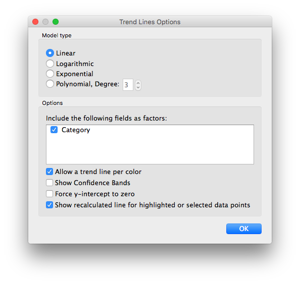
In the Trend Line Options dialog box, clear the Show Confidence Bands check box, and then click OK.
This gives us a scatterplot with trend lines that looks like this:
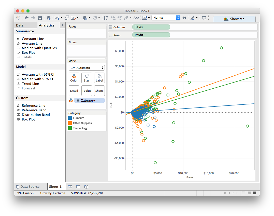
*Piazza Post pt. 2*: Does the blue trend line match your intuition about the profitability of furniture sales? Why or why not?
Now it's time to play with some real data!
Start by downloading one of the sample data files available at Tableau > Resources
Load the dataset into Tableau and explore the correlations between various measures.
Deliverable: Create a scatterplot that highlights something interesting in your dataset. Post your visualizations to Moodle along with a brief description of what you found.