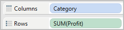
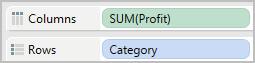
Use bar charts to compare data across categories. You create a bar chart by placing a dimension on the Rows shelf and a measure on the Columns shelf, or vice versa.
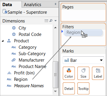
A bar chart uses the Bar mark type. Tableau selects this mark type when the data view matches one of the two field arrangements shown below. You can add additional fields to these shelves.
For more information about the Bar mark type, see Bar Mark.
| Creates Vertical Bars | Creates Horizontal Bars |
|
|
|
To create a bar chart that displays total sales over a four-year period, follow these steps:
Connect to the Sample - Superstore data source.
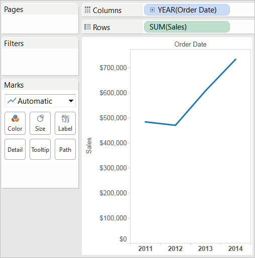
Drag the Order Date dimension to Columns.
The data is aggregated by year and column headers appear.
Drag the Sales measure to Rows.
The measure is aggregated as a sum and an axis is created. The column headers move to the bottom of the view.
Tableau uses >Line as the mark type because you added the date dimension.
On the Marks card, select Bar from the drop-down list.
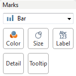
The view changes to a bar chart.
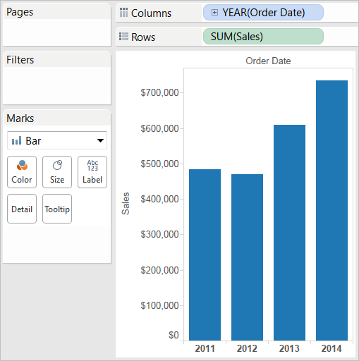
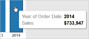
The marks (which are bars in this case) are vertical because the axis is vertical. The length of each mark represents the sum of the sales for that year. For example, the sum of the sales in 2014 is $733,947, which you can verify by hovering over that column.
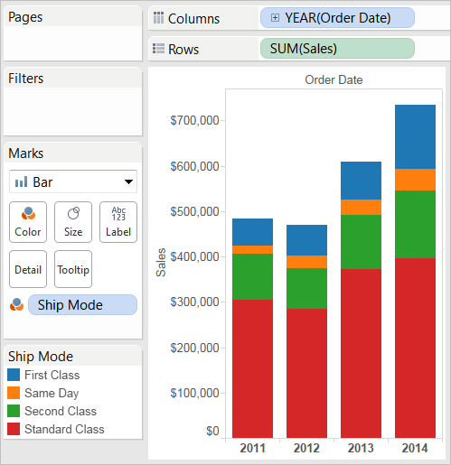
Drag the Ship Mode dimension to Color on the Marks card.
The view shows how different shipping modes have contributed to total sales over time. The ratios look consistent from year to year.
Drag the Region dimension to Rows, and drop it to the left of Sales to produce multiple axes for sales by region.
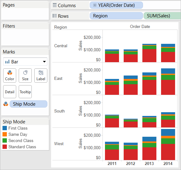
To view data in the West region only, you can filter out the other regions. To do this, drag the Region dimension again, this time from the Data pane to the Filters shelf.
In the Filter [Region] dialog box, clear the Central, East, and South check boxes, and then click OK.
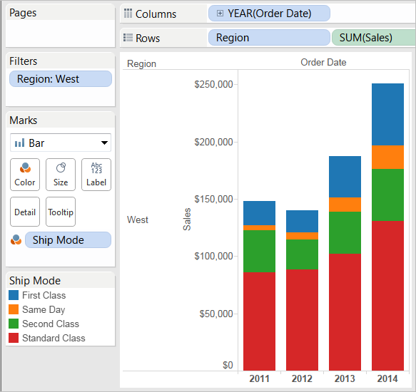
This view gives you insight into your data—for example, how the ship mode changed in the West over the four-year period.
Line charts connect individual data points in a data view. They provide a simple way to visualize a sequence of values and are useful when you want to see trends over time, or to forecast future values. For more information about the line mark type, see Line Mark.
To create a view that displays the sum of the sales and the sum of the profit for all years, and then uses forecasting to determine a trend, follow these steps:
Drag the Order Date dimension to Columns.
Tableau aggregates the date by year, and creates column headers.
Drag the Sales measure to Rows.
Tableau aggregates Sales as SUM and displays a simple line chart.
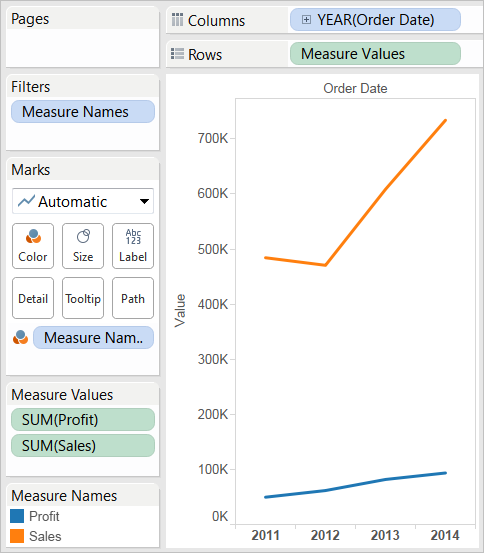
Drag the Profit measure to Rows and drop it to the right of the Sales measure.
Tableau creates separate axes along the left margin for Sales and Profit.
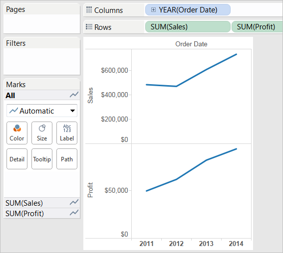
Notice that the scale of the two axes is different—the Sales axis scales from $0 to $700,000, whereas the Profit axis scales from $0 to $100,000. This can make it hard to see that sales values are much greater than profit values.
When you are displaying multiple measures in a line chart, you can align or merge axes to make it easier for users to compare values.
For more information about aligning the axes, see Dual Axes.
For more information about enforcing a single axis across multiple measures, see Blended Axes.
With either of these options, you can create a combination chart to change the mark type for one of your measures.
For more information, see Combination Charts.
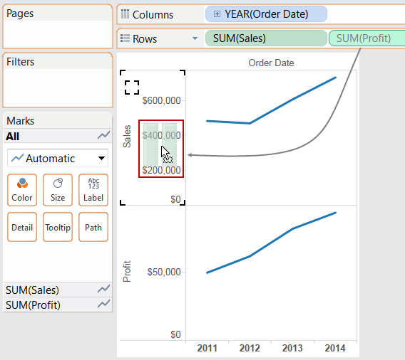
Drag the SUM(Profit) field from Rows to the Sales axis to create a blended axis. The two pale green parallel bars (shown in the red box) indicate that Profit and Sales will use a blended axis when you release the mouse button.
The view updates to look like this:
The view is rather sparse because we are looking at a summation of values on a per-year basis.
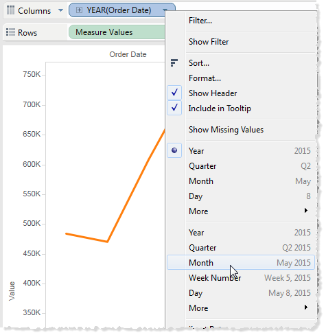
Click the drop-down arrow in the Year(Order Date) field in the view and select Month in the lower part of the content menu to see a continuous range of values over the four-year period.
The resulting view is a lot more detailed than the original view:
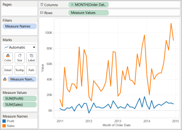
Notice that the values seem to go much higher just before the end of each year. A pattern like that is known as seasonality.
To get credit for this lab, create a story with a new data set of your choosing: