Besides just an understanding of how to make maps, we hope that students leave the SAL with an appreciation for the power inherent in making and presenting maps. An exhibit currently on display in the Knowledge Lab called Undesign the Redline highlights a particular set of maps known as Redlining Maps which have powerfully shaped the social landscape of the entire country. These maps, made by the Home Owners’ Loan Corporation in the 1930s, divide most major American cities into zones which are fit and unfit for investment. The unfit areas were marked with a red line (hence the term “redlining”) and their residents were denied mortgages that could have enabled them to buy homes. This pattern was reinforced and reproduced as redlined areas continued to be denied access to resources like insurance and credit throughout the 20th century.
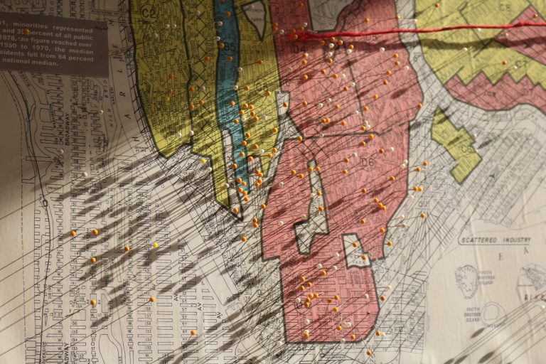
A red line map that is part of the exhibit with pins indicating visitors’ homes
The exhibit features redlining maps of Holyoke and Chicopee which we definitely recommend checking out. The SAL also had the opportunity to contribute to the exhibit. Several student projects that involve Story Maps are on display in the exhibit. This includes several maps from Prof. Lisa Armstrong’s class Gender, Land, and Food Movements about a Springfield urban farming organization called Gardening the Community. The maps tell the story of how GTC is countering the lack of fresh food in the Four Corners neighborhood that resulted from denying resources to this area. Also on display is a map created by students in Prof. Jack Loveless’s class Modeling our World for Kestrel Land Trust about food deserts in Chicopee. The students happened to be in the SAL while we were having a planning meeting for the exhibit, and noticed that a large area of food desert in Chicopee today was redlined back in the 1930s.
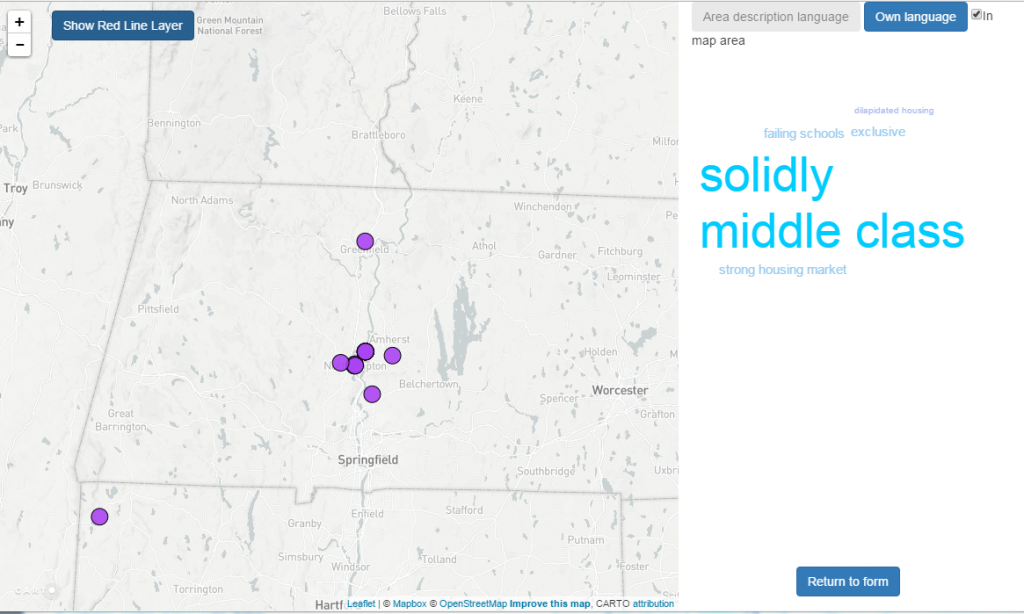
A screenshot of the web map in the Undesign the Redline gallery
Jon and Scott also collaborated with the exhibit organizers — Miriam Neptune and Deborah Keisch in the library and NYC design studio “Designing the WE” — to create an interactive map that allows visitors to the exhibit to reflect on their experience. Visitors can choose words selected from area descriptions of redlined areas that they feel have been used to describe their home, and then they describe their home in their own words. The results from all of these submissions are displayed on a map, which has a word cloud on it to show the most common responses from different areas around the country. If you’re on campus, you can access the map here.
The exhibit is on display until March 9 in the Knowledge Lab, on the 2nd floor of Neilson Library. There are some amazing events associated with the exhibit, including a panel tonight (Th 2/16) on Race+Class, Space and Design, and an Undesign Researchfest on Friday 3/3 during which the SAL will hold a community mapping workshop. Find out more about these events and the exhibit in general on the Undesign the Redline website.