And the answer is…
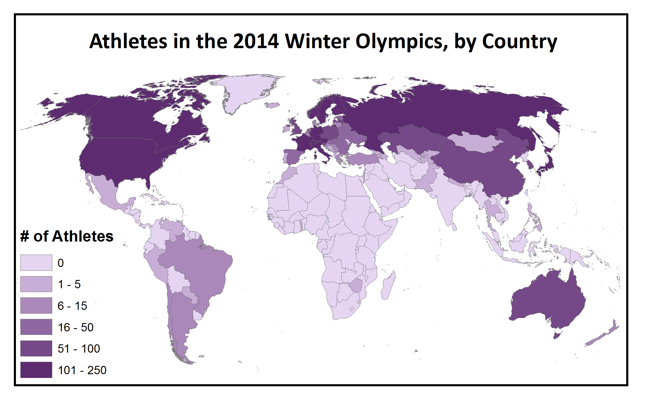
The February Mystery Map challenged you to match four different maps of the world with the quantitative variables they showed, and prompted all interested spatial thinkers and pattern detectives to question things like: “Which areas are more heavily represented in the Winter Olympics, and which areas are more represented in the Summer Olympics?” and “Does Winter Olympics participation correlate spatially with alcohol consumption or national GDP?”
Check out the answer below! (Click to enlarge.)

Now that you know which variable corresponds to each map, do the patterns make sense? What geographic pattern is evident in Winter Olympics participation? Which two maps are the most similar, and why do you think that is? Are there any surprising patterns among the four maps?
And the winner is …
Congratulations to Jessica, a Smith student and the first person to correctly match all four maps with the variables they show! We asked he how she figured it out and she said:
” I relied on three assumptions. First, American adults drink less, on average, than most of their European counterparts, so I figured that the since the pink map is the only one on which the US isn’t in the highest bracket, it must record average alcohol consumption. Second, Russia has a relatively low gross domestic product but sends a lot of athletes to the Olympics, so I settled on the only map where Russia isn’t in the highest bracket–the orange one–for GDP. And finally–in a slightly more haphazard dedication–I figured that the countries participating in the winter Olympics would probably be concentrated in colder climates, so I settled on the purple map, since its “highest/most” countries are less geographically diverse, and generally colder, than those on the green one.”
Making of the Map
Click to enlarge!
This Mystery Map drew on four different data sources, which we transformed to a map format in similar ways. First, we started with the Winter Olympics– we saw a map of the different numbers of athletes participating in the Sochi Games and, noticing how heavily skewed it was towards the wealthy developed nations in the Northern Hemisphere, we thought, “Huh, I bet that map looks very different than the map of participation in the Summer Olympics” … and a Mystery Map was born. The datasets for the Winter and Summer Olympics were taken from Wikipedia (we tried to find data from the International Olympic Committee or any other site, but Wikipedia had the most well-documented data in the easiest-to-use format!).
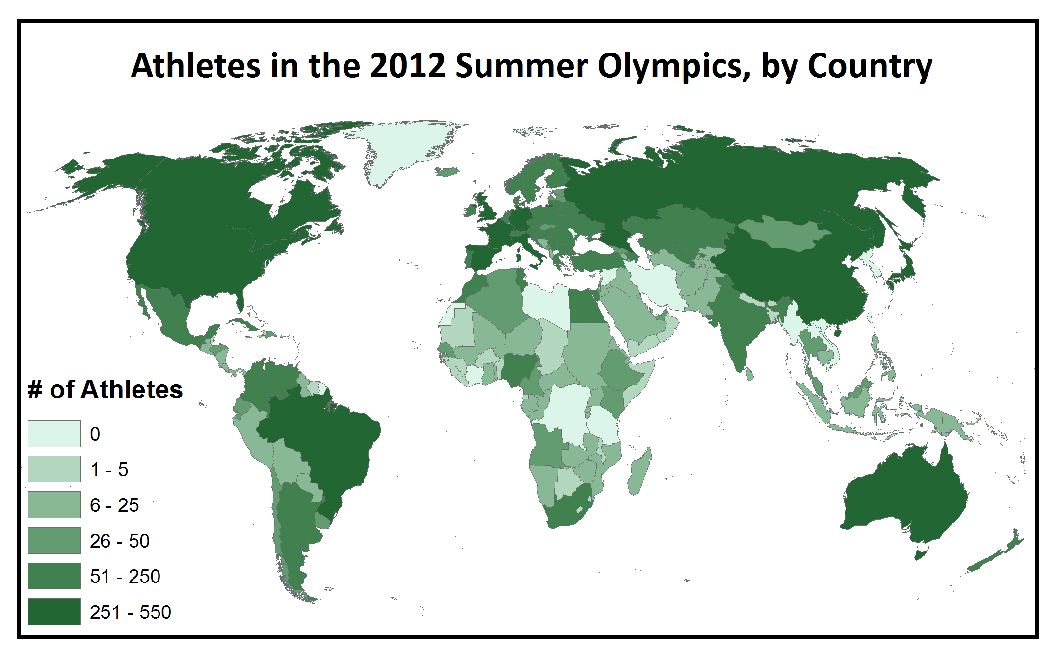
These tables (Winter Olympics here, Summer Olympics here) were not exactly map-ready … it took some massaging of the data to transform it from a text list to a tab delimited file to an Excel Spreadsheet, to get it into a format that would join correctly with our ArcGIS shapefile of the country outlines. Once we had the data properly formatted into a table, there were still hidden traps: the country names from the Wikipedia data didn’t always match exactly with the country names in our map shapefile– lots of countries were missing a “Republic of” at the beginning of the country name in one of the tables, but they needed to match perfectly including capitalization and spacing to join properly. Once the data was joined, we could use the numbers of athletes participating in each Olympic Games as the numeric value that determined the shade of the corresponding country, which is a process called choropleth mapping.
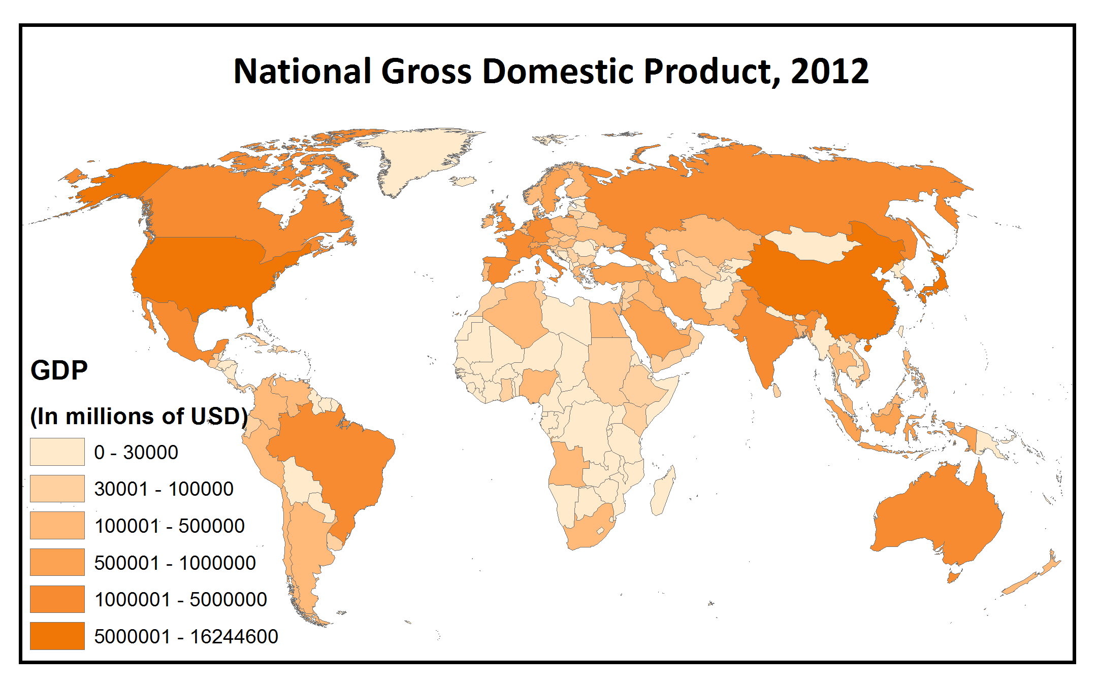
The data for the GDP map came from the World Bank downloadable data interface, which is an excellent resource for socioeconomic data relating to development indicators such as the Millennium Development Goals. While it is possible to view web-generated maps on the World Bank site linked above, unfortunately at this time you can’t download data in a map format, so we were back to the old table join grind. However, there was one seriously lucky break– in addition to country names, the World Bank data table included a column of 3-letter codes to identify countries that corresponded exactly to a similar data field of codes in our map data. This made the joining process much easier! Instead of editing everything by hand to make sure that “United States” would match up properly with “United States of America,” all we had to do was join “USA” to “USA.”
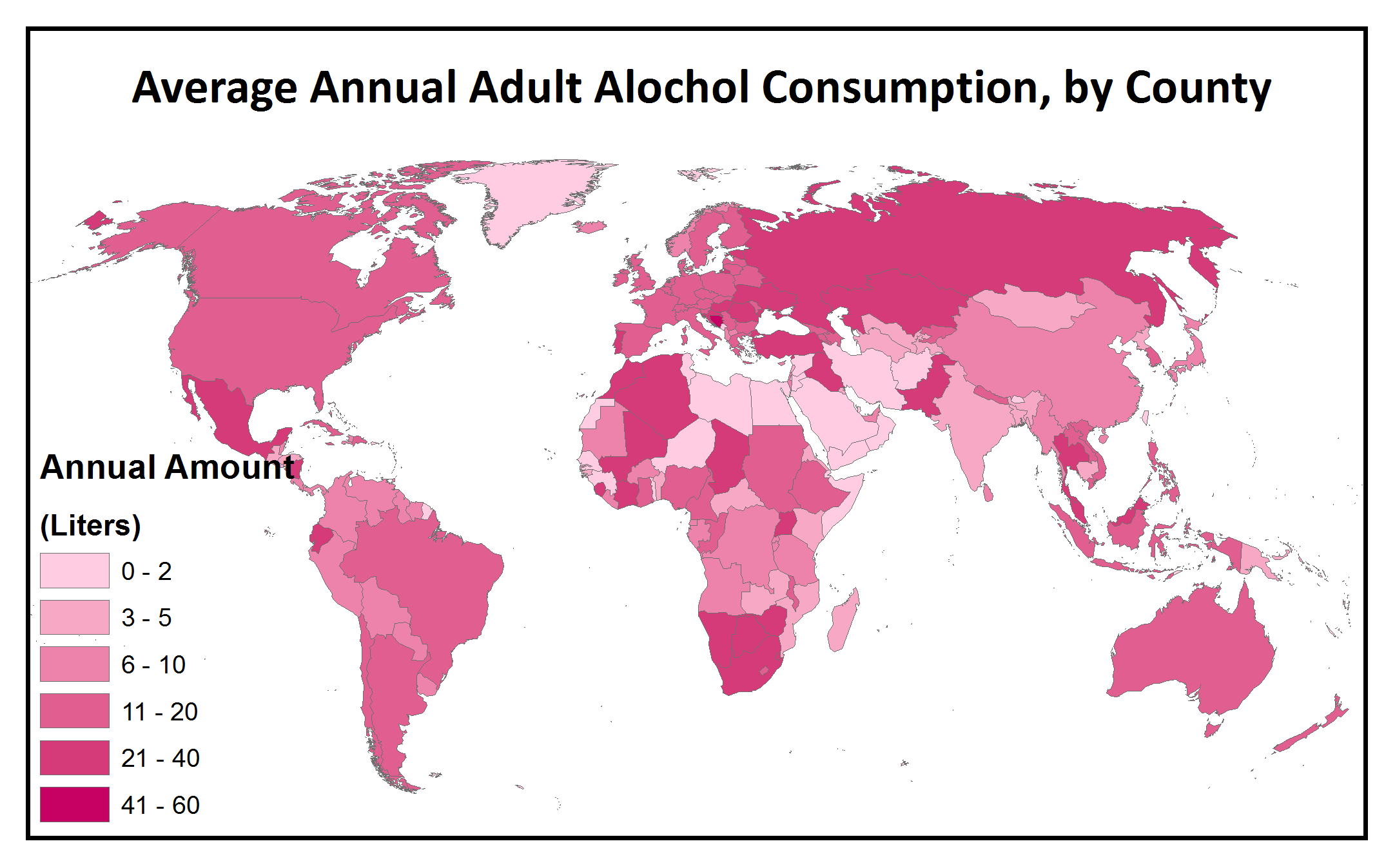
The final map was based on alcohol consumption data from the World Health Organization’s Global Health Observatory Data Repository. Along with the World Bank site, this is another excellent source of worldwide national- and provincial-level data that is well-organized, well-documented, and free to download. However, some of the maps on their site make me cringe for their color, layout, and projection gaffes! All the more reason to get into the data yourself. The wealth of data on this site could be the inspiration for an entire class worth of Introductory GIS projects, and just like the world bank data, the tables include 3-letter codes making it straightforward to join this tabular data to spatial shapefiles. After getting lost in several health-indicator rabbit holes, we decided to go with alcohol consumption to provide a visual comparison with the other variables included in the Mystery Map, partly because the Olympics have a reputation of being a big party.
So there you have it! Four different maps, four different data sources. This month’s Mystery Map was a pleasure to put together, and it is always nice during the Olympics to stop and think what other global social, economic, and political factors could be correlated with participation in, and access to, this international pinnacle of athletic competition.
Statistics
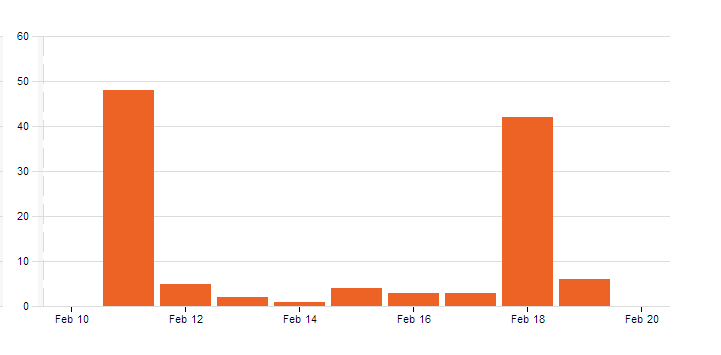
This was one of the most popular Mystery Maps yet! Over 100 people viewed the map, with nearly 50 people submitting guesses. Of those guesses, 27 people correctly identified that the purple map showed the Winter Olympics participation, and 15 correctly matched all four variables with their corresponding map! The winner was a Smith student who guessed all four maps correctly within 45 minutes of the Mystery Map being announced in the E-Digest last Tuesday! To the left is a graph of Mystery Map views, with the spikes on successive Tuesdays proving once and for all that people actually read the E-Digest.