Cozy rendition of ///traditional.vintages.primer:

This past Wednesday was GIS Day, we coalesced our spatial friends in the Valley and across the state to celebrate the mappiest day of the year. The month of November also marks the #30DayMapChallenge, a call to make a themed map every day – with Day 18 as “Land Use” (How land is used, within a city, region, country or continent? How has it changed?”) We hosted a Cartography track where people can exchange ideas, data, and carto-tique each other’s maps made during the session for the land use challenge. The resources shared are somewhat captured below:
* Color palette using Colorbrewer – you can accommodate color blindness by enabling “colorblind safe;” in QGIS, you can preview your map in colorblind mode. Another simulator is Color Oracle
* Entries for #30DayMapChallenge
* John Nelson’s cartographic tips & tricks
* Daniel Huffman’s somethingaboutmaps blog
My mapspiration came from several sources: I have been enjoying cartographer Sean Conway’s work tremendously – he georeferencs historical maps and overlays high resolution LiDAR terrain in ArcGIS Pro and Blender to produce these stunning relief maps. Making maps in a material sense – whether it’s 3D printing, laser cutting, chocolate making, or crafting. (By the way, you can make your own 3D printing file using Terrain2STL, or if you want finer resolution than the 90m SRTM (Shuttle Radar Topography Mission), you can use your own DEM and follow our guide using QGIS here.) And finally, I’ve been playing Settlers of Catan and thus reminiscing my favorite entry to the map gallery at last year’s Esri User Conference: “The Settlers’ of the United States of Catan”
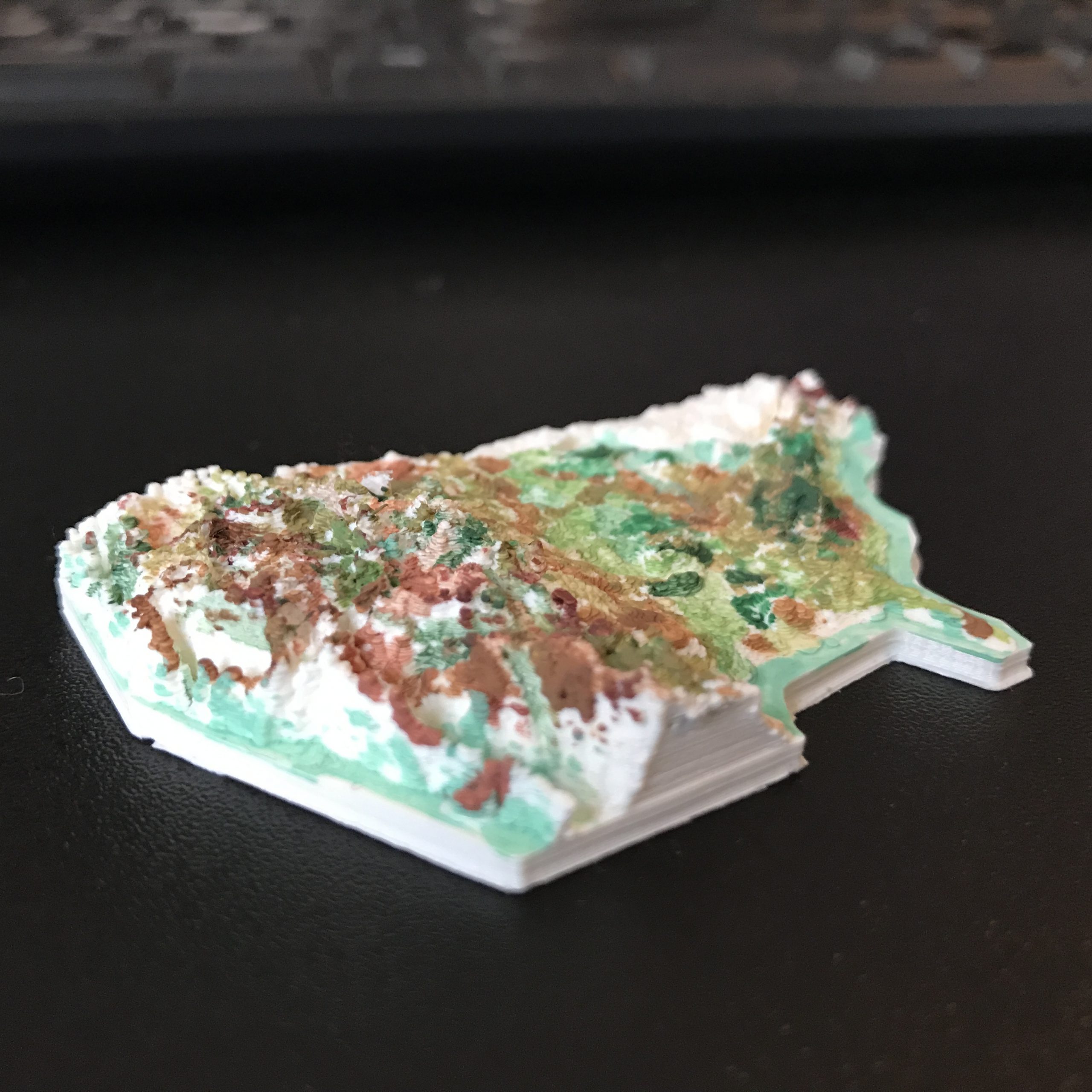
3D printed terrain model of the contiguous US, you might recall its edible counterpart more fondly
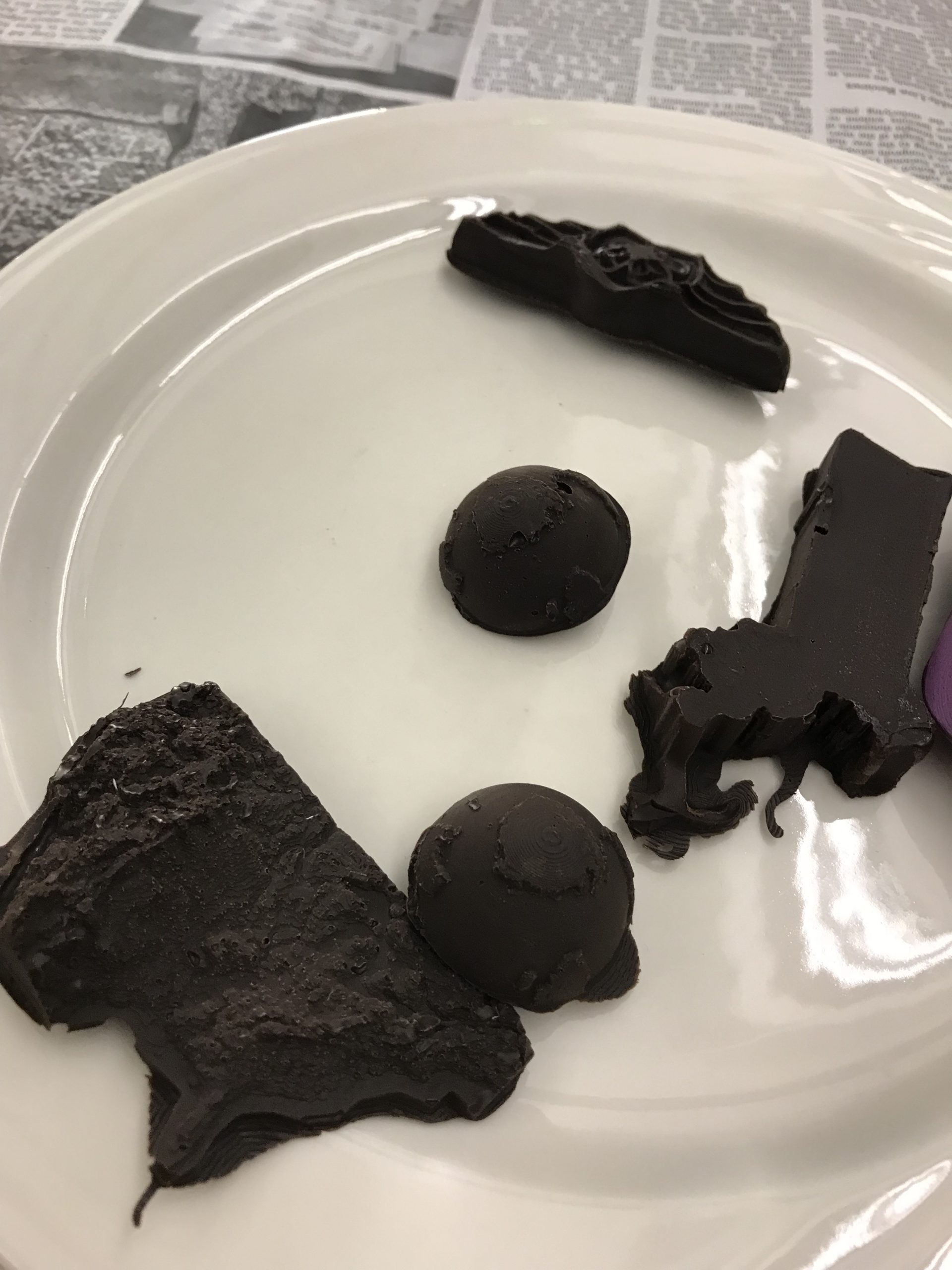
Chocolates from GIS Day 2018
The area of interest is MacLeish Field Station, where we’ve been gradually curating datasets generated by and for the Smith community for research and discovery. To create the hexagon tiles, I used Generate Tessellation for the land use/land cover layer, then Select by Location to query the tiles that intersect the MacLeish boundary. To determine the types of land use present in each tile, I first used Tabulate Intersection – which cross-tabulates the hexagons and land use layer to calculate the percentage of each land use type. Summarize Within grouped attribute by field within each tile, in this case, the majority and minority land use. After the analysis is a matter of symbology. Incidentally, there was an elusive resource about cartographic knitting patterns mentioned during the workshop (TBD – to be tracked down), which reminded me of John Nelson’s purls of wisdom. The color is derived from the suggested color scheme from NOAA’s C-CAP (Coastal Change Analysis Program). Dylan Moriaty’s Textures & Patterns would’ve been a fitting approach – perhaps images sampled from our recent drone surveys.