By Hannah Dillahunt ’21
On May 25th 2020, George Floyd was killed in Minneapolis, Minnesota. An unarmed black man, Floyd was killed by a Minneapolis police officer while 3 of his coworkers silently watched.
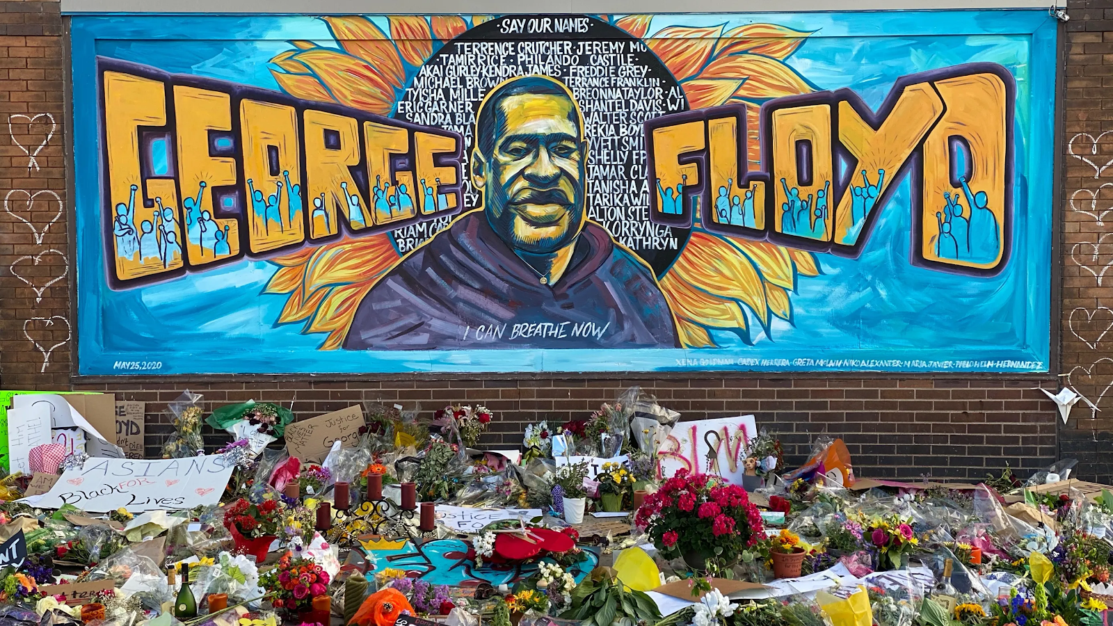
A Minnesota native, I watched as my community grieved the loss of an innocent life. As grief, anger and frustrations spread across the country, the Black Lives Matter (BLM) movement sparked protests in almost every major American City.
After George Floyd’s death and months of protests across the country, geographers went to work representing the Black Lives Matter movement and racial injustices all throughout the country. In this post, I will be looking at how the Black Lives Matter movement and the injustices against Black Americans it calls out have been spatially represented in a map created by the University of Minnesota.
The resource I will be sharing in this post is titled Mapping Prejudice (https://mappingprejudice.umn.edu/). This resource contains two maps that work to visualize how racial covenants from the first half of the 20th century have shaped the current racial divides in Hennepin County (Minneapolis and its surrounding area). Minneapolis has one of the largest economic and educational divides between black and white citizens in the entire country. For more information on this topic, I found this article by the NY Times very insightful: https://www.nytimes.com/2020/06/01/us/minneapolis-racism-minnesota.html
Defintion – Racial covenants were “racially-restrictive deeds” placed on neighborhoods that prohibited black and non-white Minnesotans from buying or renting on a certain lot or in a particular neighborhood.
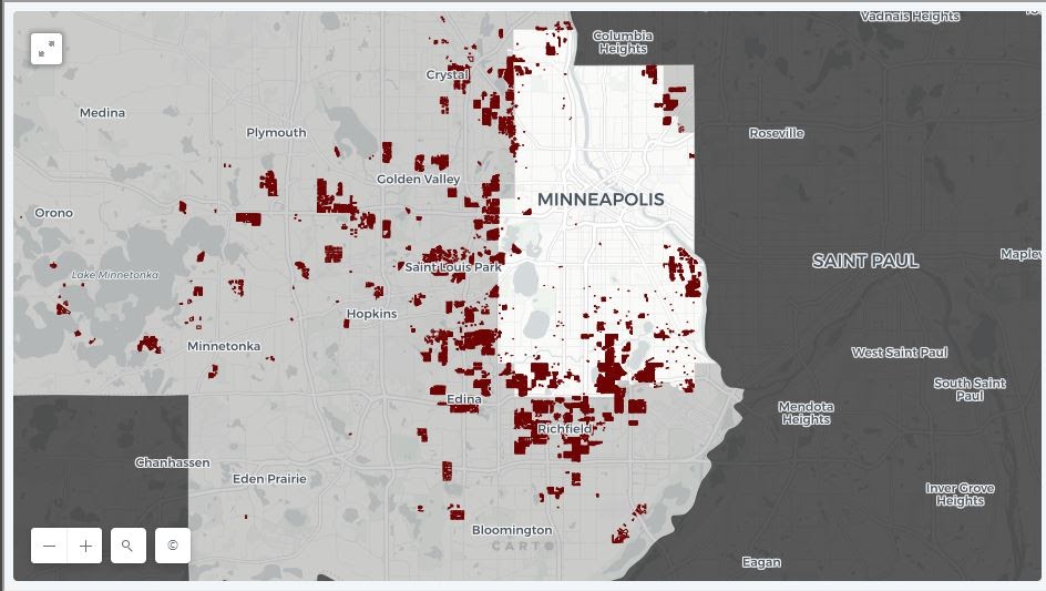
The Mapping Prejudice site has two mapping options, a time lapse option and an explore option. I will be focusing on the time lapse map first. I really liked how the time lapse map visualizes how quickly racial covenants spread and how prevalent they became in Hennepin County. These decisions made by realtors from the 1910s to the 1950s drastically segregated Minneapolis and pushed black citizens into limited spaces. The time lapse map has a counter that shows the year and the growing number of racial covenants over a span of 40 years. This is a very strong spatial tool that clearly shows Mapping Prejudice’s argument of why Minneapolis is currently a majority white city.
However, as there is no legend for the map, it is unclear what the colors the creators choose are representing. As the number of racial covenants increases over time, the areas where racial covenants exist change from blue to white. This implies that white represents areas with a higher concentration of racial covenants and blue represents areas with a lower concentration. To help the viewer understand how many racial covenants exist in a neighborhood, it would be helpful to have a legend that contains a gradient key. This key, which would be a gradient from dark blue to white, would show the number of racial covenants expressed by the color white and the number of racial covenants represented by dark blue. Having a legend, would better express to what extent certain neighborhoods prohibited black residents and create a stronger argument for why certain areas of Minneapolis are mostly white today.

The other map option on the Mapping Prejudice site is an explore option. This option lets viewers take a closer look at where racial covenants existed in different neighborhoods. It also allows viewers to click on the individual racial covenants, represented in dark red, to view the exact wording of the racial covenant deed, when it was put in place and information about the lot it exists on. I really liked having the ability to see the exact wording for individual lots. I thought the explore map was easily accessible and gave information that better expressed the blatant racial attitudes realtors and landlords had during the first half of the 20th century. I also like having the option to search for certain addresses. As someone who has lived in Hennepin county their entire life, it is extremely disheartening to see how my community was, and has continued to be, racially segregated.
Overall, I thought the explore option was very easy to use. To improve its accessibility, I think it would be helpful to carry over the color scheme from the time lapse option. Such as highlighting areas in white that have large concentrations of racial covenants and areas in dark blue that had smaller concentrations. Another addition I would make would be to state what years the map represents. For example, creating a title such as “Racial Covenants of Hennepin County: 1910 to 1950”. As the time lapse map is centered around time, I think it would be helpful to the viewer to understand what part of the time lapse option this explore map highlights.
Having resources such as Mapping Prejudice help our country understand and come to terms with the racial attitudes our society was built upon. Mapping Prejudice in particular shows why the Black Lives Matter movement is so crucial in supporting black Americans who are continually being affected by racist decisions made 50 to even 100 years ago.